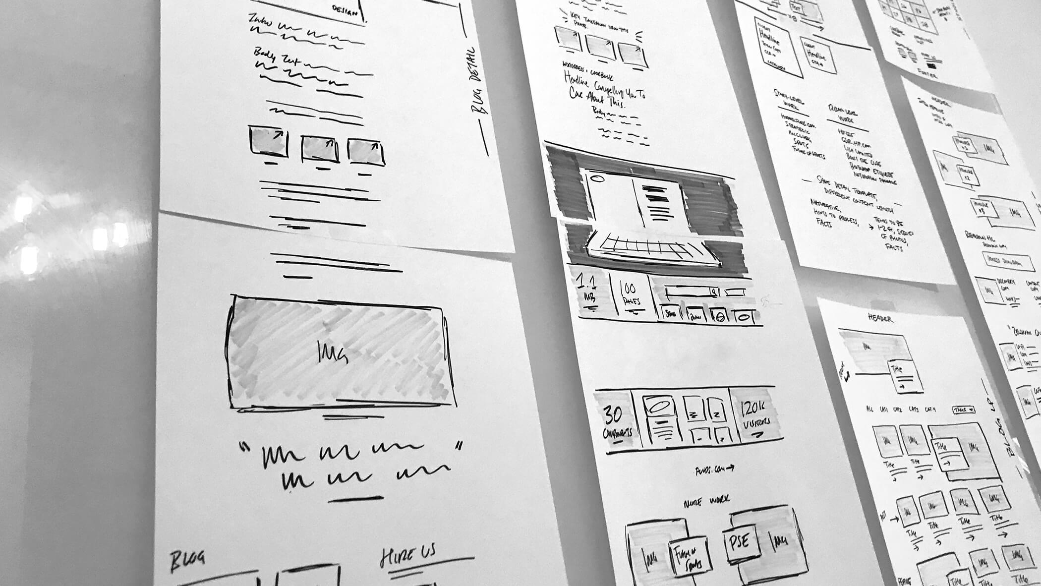
All good ideas start *somewhere*. Oh, that all “good” websites start out as perfectly crafted mockups. The reality is your favorite website likely started as a sketch on a whiteboard—a shell of the glory it would eventually have. To miss this point is to not only underestimate the distance an idea needs to travel, but to potentially underappreciate the cruder phases of web design.

When our studio talks about fidelity, it’s in relation to the finished, launch-ready site.
High-fidelity (hi-fi) materials precisely echo the style, layout, and content intended for launch. Conversely, low-fidelity (lo-fi) materials roughly imagine these facets. These materials range from analog sketches—paper, whiteboard, or otherwise—and digital layouts like wireframes and gray box prototypes.
At Adjacent, lo-fi materials are an invaluable part of the process, allowing us to work fast through rough ideas without being concerned with the time and effort it takes to polish them. This may seem like an internal, self-serving benefit, but we also dig lo-fi explorations for how beneficial they are to collaboration:
Methods like paper sketches allow the entire project team to generate and contribute ideas at the same pace as we do.
Even still, there’s an understandable resistance for our clients and partners to join the lo-fi party:
“I Need to See It”
We can’t argue that the higher the fidelity, the easier it is to visualize what something might become. However, working in hi-fi too early tends to rob our team of opportunities to evaluate multiple ideas and gather useful, relevant input with you and your team.
Let’s say we just finished a brief Discovery and you’d like us to put together page mockups. Our hesitation in jumping to such a high-fidelity format is that we’ve yet to have any reasonable ideation with the project team. Admittedly, the odds of our stepping up to the plate and hitting home runs in style, layout, and content are fairly slim. Instead, we’d rather talk about these facets in lower fidelity, where our ability to course-correct is quicker and easier than adjusting mockups.

Even in print, SU found a lo-fi version of their Admissions Package helpful in imagining the possibilities.
On the other side of the coin, we understand the limitations of looking at gray boxes. That’s why we attempt to complement the gray-box, layout-focused discussions with visually explorative, style-focused discussions. These two tracks work in concert—often more efficiently than mockups—to help everyone on the team “see” where the site is going.
In fact, our lo-fi efforts are attempting to better inform you, so that by the time we’re ready for hi-fi, you already have a solid expectation—and understanding—of how things will turn out. Our goal is to have you and your team so involved and confident in our lo-fi explorations that we have no need for inefficient page mockups. Through distinct, focused explorations, you’ll be better equipped to understand how—and why—everything merges together.
“I Don’t Have Time For It”
Maybe you’re sold on the importance of lo-fi, but your role as a C-level leader limits your project involvement to the point where you’re tempted to just see a few mockups or a finished prototype for approval. However, we urge you to realize that you are the very person lo-fi explorations can benefit the most. You likely have the most influence over the project’s decisions internally, which makes you the person who should best understand the rationale behind layout, style, and content.
When you’re involved in idea generation and frequent critique, something interesting happens. You go from being a spectator to a participant, and from a benefactor to an advocate. A champion. An owner. Our team can’t be the sole campaigner of the design decisions for your site; the future viability of your site is ultimately something your team will need to support and defend, which is why your involvement from the beginning is so crucial.
In the event you truly can’t be as available for lo-fi discussions as we’d hope, empowering your team to make and own these decisions helps everyone maintain progress and forward momentum.
“I Don’t Have the Budget”
It’s logical to want to cut out of a project the stuff that’s seemingly the furthest from the final, on-screen product. On-site discoveries, research and interviews, and lo-fi explorations are seemingly logical candidates for omission. It’s our experience that the time “gained” by skipping lo-fi results in poorly informed, home run swings-and-misses in hi-fi, translating to more revisions and do-overs. Ironically, these often exceed the time and money “gained”.
To this end, we don’t offer the option of omitting lo-fi. Instead, we recommend scoping your project to something you can afford, and schedule features and enhancements for future, post-launch phases of your site.
On the surface, low-fidelity exploration can seem like a behind-the-scenes part of the process that doesn’t—and perhaps, shouldn’t—involve clients.
At Adjacent, we’ve flipped that notion on its head, and prefer to make our clients a vital part of sketching, gray boxing, and all the rough steps that work to better inform the “polish” of a site. Along the way, our clients actually become better advocates of the products we help create for them.