Skip to content
11.12.19

The Magic of Tidy CSS

Tom McCaffery
Development

CSS started off very simple.

a man lying on one of many overlapping grass platforms

I’ll be the first to admit my first use of it in the early 00’s was solely to strip the “uncool” underline and purple visited color from links.

Since those days, however, CSS has assumed many more important roles: choreographer of layouts, arbiter of style consistency, translator between myriad devices, and guardian of the sacred partition between content and presentation.

Today, hand-scrawling a single, rambling style.css old-school tends to get you only so far before you start hitting walls (or worse, imperceptible inclines) of frustration.

Fortunately, there are both tools and techniques that can help you wrangle the inherent complexity of modern CSS while keeping your code manageable and tidy. Let’s get to it!

Get Sassy

If you’ve been living under a rock the last decade, you’ve missed the rise and near-domination of compile-to-CSS preprocessors like Sass and LESS. While they aren’t absolutely required (and those with rose-colored glasses will say the web was more innocent before anything needed to be compiled), tools like Sass will make dealing with modern CSS an order of magnitude easier.

I could probably run a separate blog entirely focused on build tools, but to keep it short (and myself sane), I highly recommend you get Sass and rename your files to .scss to begin making use of its amazing features. Conveniently, its SCSS syntax is a superset of CSS, meaning your existing CSS files are already valid SCSS files.

Sass Misfeature!

Sass originally debuted with its own ill-conceived language with the same name (using a .sass extension). Ignore it—SCSS is the way to go (you’ll thank me later).

Break It Down

Managing complicated CSS requires equal parts high- and low-level organization. Starting at the high level: make sure you’re breaking apart your files into manageable, logical parts.

Splitting up your CSS into multiple files can have a few surface-level benefits, like having a clearer git history, finding the code you need faster, or even less scrolling. But more power lies in how you do the splitting.

Jonathan Snook’s SMACSS (Scalable and Modular Architecture for CSS) guide advises separating rules so they fall into a few high-level categories. The first three are most relevant:

  • Base – Generic, default styling of elements you want to apply across your whole site.
    Examples: reset stylesheet, body font, link styles, list styles.
  • Layout – The arrangement of large containers that make up the high-level structure of your site.
    Examples: site container, header, footer, sidebar, columns.
  • Components – Self-contained, nestable elements that can provide utility anywhere they’re dropped. (SMACSS calls these “modules”, but the concept is the same.)
    Examples: Newsletter signup CTA, article card, team member hero.

You can see as you move from Base to Layout to Components, the CSS rules start out global and become increasingly narrow. This is on purpose—keeping these scopes separate forces you to think of exactly which elements of your site you’re affecting and discourages mixing them together. Think of rules that straddle these boundaries as little mines: the next unsuspecting developer might think they’re fixing a corner case on one little component, and BOOM—broken layouts on every page.

The categories above could translate directly into your code. You can split up your files, then import them into one master stylesheet:

@import 'base.css';

@import 'layout.css';

@import 'components/foo.css';
@import 'components/bar.css';
Sass Feature!

While native CSS supports loading external files via @import, Sass will combine them right into the final output, avoiding multiple browser requests. You can even leave off the .scss extension.

Here’s how you might prepare for a more complex site where your layout and base segments grow a bit too large for one file each:

@import 'base/reset';
@import 'base/forms';
@import 'base/typography';
@import 'base/print';

@import 'layout/layout';
@import 'layout/header';
@import 'layout/footer';

@import 'components/foo';
@import 'components/bar';

Be Selective With Your Selectors

Once you’ve committed to writing surgical CSS that only targets what it needs to, you begin to run into another quirk.

CSS is inherently global—every rule in your stylesheet is evaluated by the browser in relation to the entire site. It’s up to you to wrap your rules in enough selectors to narrow down the impact.

And while CSS gives you tons of flexibility, there are hidden traps waiting for you. Consider this puzzle: can you guess, at a glance, which color this button ends up being?

.cta a.button {
  background-color: red;
}

.site-container .button {
  background-color: green;
}

#cta-button {
  background-color: blue;
}

.button {
  background-color: yellow;
}

If you guessed red, green, or yellow, you lose. If you guessed blue, you also lose, because nobody wins with code like this.

Every combination of selectors you use to whittle down your CSS rules can have different effects on specificity, or which rule will win out when multiple selectors could apply to a given element.

There are some techniques you can follow in new projects that avoid what Nicole Sullivan calls a “hostile code environment”—a project with such specific CSS rules that it’s difficult to add to or even understand quickly. Pity the poor soul who later has to turn our button above purple and add to the top of the Jenga tower of selectors…

Style by Class, Not by ID or Tag

Classes are the most flexible of CSS selectors: they can apply to any element, elements can mix and match multiple classes, and there’s no expectation that a class is unique on a given page.

Selecting by ID is ten times more specific than class name, which is ten times more powerful than element name. By only ever styling by class, you avoid accidentally creating overly-specific rules that make subsequent overrides harder.

// BAD:
#myid.widget-a {
  // Specificity: 110
}

div.widget-a {
  // Specificity: 11
  // Whoops, this selector isn't specific enough to override!
}

.widget-a {
  // Specificity: 10
  // Whoops, this selector isn't specific enough to override! 
}

// GOOD:
.widget-c {
  // Specificity: 10
}

.widget-c {
  // Specificity: 10
  // Wow, super easy to override styles later on!
}

This levels the playing field of specificity highlighted above, ensuring that you only have to make your selectors minimally specific to override a style.

Flatten the Hierarchy, Power to the Components

Another powerful tip is to carefully consider and limit your use of the descendant combinator. To those other than CSS-spec-reading-geeks, this is when you combine selectors with a space, changing how elements appear when they’re inside other elements.

// Default styles
.cta-button {
  font-size: 14rem;
  color: blue;
}

// A special case where we wanted the button to
// change inside of some promos.
.big-promo .cta-button {
  font-size: 20rem;
  color: red;
}

// Now the homepage wants a different color button
// on its big promo. Whoops, we're going to have to
// include .big-promo in the selector to make sure it overrides!
.page-home .big-promo .cta-button {
  color: green;
}

This example is just the start of the problems. What happens when you want to reuse the same style somewhere else? Or override in an even more specific scenario? Just Add More Selectors™?

You should strive to keep as few levels of descendent selectors going on as possible—style things based on what they are instead of what they’re inside of. This not only helps avoid specificity wars, but also helps you think of your styles as collections of reusable components, not just loosely-related variations of styles painted on a pixel-perfect page.

// Default styles
.cta-button {
  font-size: 14rem;
  color: blue;
}

// Modifier classes (these are in addition to
// the default class).
.cta-button-big {
  font-size: 20rem;
  color: red;
}

.cta-button-homepage {
  color: green;
}

In the improved example above, we’re using only one level of class to describe both the default and two different overrides. Now, not only are future overrides easier, but we also gain some benefits of clarity—when looking at the CTA button’s CSS file, we see at a glance how this component can change, and these changes are “opt-in” by applying classes in the HTML instead of unexpectedly applied when the component is included on a specific page. Of course, there are still instance in which the descendent selector makes sense, but using it judiciously will make things less frustrating.

Sass Feature!

Sass lets you nest CSS rules inside one another, which generates descendent selectors behind the scenes with a lot less typing on your part.

In the next installment of this series, we’ll dive further into BEM, a popular technique of naming and organizing your styles that takes this idea of self-contained components to its logical conclusion.

Don’t Repeat Yourself Yourself

The programming field has long embraced the concept of Don’t Repeat Yourself (or DRY), even before it had a catchy name. The basic idea behind DRY is that copying and pasting similar code all over the place is not only inefficient, but can really create a quagmire when you later (and inevitably) need to update that duplicated code.

Though CSS is a style language and not necessarily a full-fledged programming language (this crazy CSS-only game notwithstanding), a lot of the same organizational best practices apply to both. Additionally, design systems thinking encourages repeatable, consistent ways to represent your content, which means you’ll want a shared library of styles that can be updated efficiently.

Sass has us covered with two more invaluable features: variables and mixins.

Using variables, you can store colors, font sizes, breakpoints, or anything else, and refer to them throughout your project. Here are a few examples of ways you could use variables:

// Shared color palette
$color-primary: #82bfe5;
$color-secondary: #f7f7f7;

// Shared paddings
$padding-default: 30rem;

// Breakpoints
$breakpoint-offer: 760rem;

.featured-offer {
  width: 300rem;
  padding: $padding-default;

  color: $color-primary;
  background-color: $color-secondary;
  border: 1px solid $color-primary;

  @media only screen and (min-width: $breakpoint-offer) {
    width: 100%;
  }
}

.subscribe-box {
  padding: $padding-default;
}

Mixins are like little CSS-generating factories that you stitch into your CSS. Someone looking at the final output might think you’re doing some copy/pasting, but your source files remain deduplicated and clean.

A very common use of mixins is to apply a snippet of CSS—be it an effect, layout, utility, or other repetitive task—in a way that keeps us from having to duplicate a bunch of lines of code.

/**
 * Creates an semitransparent vignette over the background,
 * starting from the bottom of the current element.
 */
@mixin vignette {
  position: relative;

  &::after {
    position: absolute;
    left: 0;
    right: 0;
    bottom: 0;
    height: 50%;
    background-image: linear-gradient(90deg, rgba(#000, 0), rgba(#000, 0.3));
  }
}

// Now we can utilize this effect anywhere it's needed.
.hero-banner {
  @include vignette;
}

.profile {
  @include vignette;
}
Sass Misfeature!

You’ll see recommendations for using Sass’ @extend syntax instead of mixins in some cases. While @extend does do some of what mixins can accomplish—letting multiple things share the same style (and with a smaller file size)—I recommend staying away from it, especially in larger projects, since it can have the side effect of unpredictably changing the order of your CSS.

Mixins can even take arguments, opening the door for making little utilities for yourself that can behave slightly differently depending on how they’re called.

/**
 * Creates an semitransparent vignette over the background,
 * starting from the bottom of the current element.
 *
 * @param $from string Origin of the gradient ('top' or 'bottom').
 */
@mixin vignette($from: bottom) {
  $angle: 90deg;
  @if $from == top {
    $angle: 270deg;
  }

  position: relative;

  &::after {
    position: absolute;
    left: 0;
    right: 0;
    height: 50%;
    background-image: linear-gradient($angle, rgba($color-black, 0), rgba($color-black, 0.3));
    
    @if $from == bottom {
      bottom: 0;
    } else {
      top: 0;
    }
  }
}

// Top and bottom gradients!
.hero-banner {
  @include vignette(bottom);
}

.profile {
  @include vignette(top);
}
Sass Feature!

OK, I broke out the @if/@else in that example, which should be a hint that the Sass rabbit-hole goes a bit deeper (arrays, loops, variable interpolation, quadifracting splines [ok, not that last one]). Be sure to check out Sass’ docs for more fancy features.

Response-ify with Mixins

Now that we’re talking mixins, let’s look at a way to use them to help tidy and compartmentalize a notoriously messy CSS task: fully responsive components.

A small note here—responsive design is hard. Some developers, and even major frameworks, reduce the idea of responsive websites to: I made accommodations for these 3-4 common screen sizes. Whenever I’m creating a new component, I resize my browser to every weird size I can think of, trying to find the combinations that make the component look bad or even break altogether. It’s at these spots that new breakpoints are needed. Otherwise, I’m not really responding to a visitor’s screen size, I’m just throwing over the “small” or “large” version of something.

While some version of responsive is better than nothing at all, you’ll end up with much better results if you think about breakpoints as fluid and plentiful, tailored to each individual component and layout. The result of this line of responsive thinking tends to be a lot of micro-tweaks, often at some really specific screen widths and heights.

In general, the more dense or heroic a component’s design is, the more breakpoints and adjustments will be needed to ensure a good experience. For instance, you may have a button whose display is so simple, it only needs a padding and text size bump here and there to accommodate all sorts of screens:

Two buttons, one at a larger size for larger screens

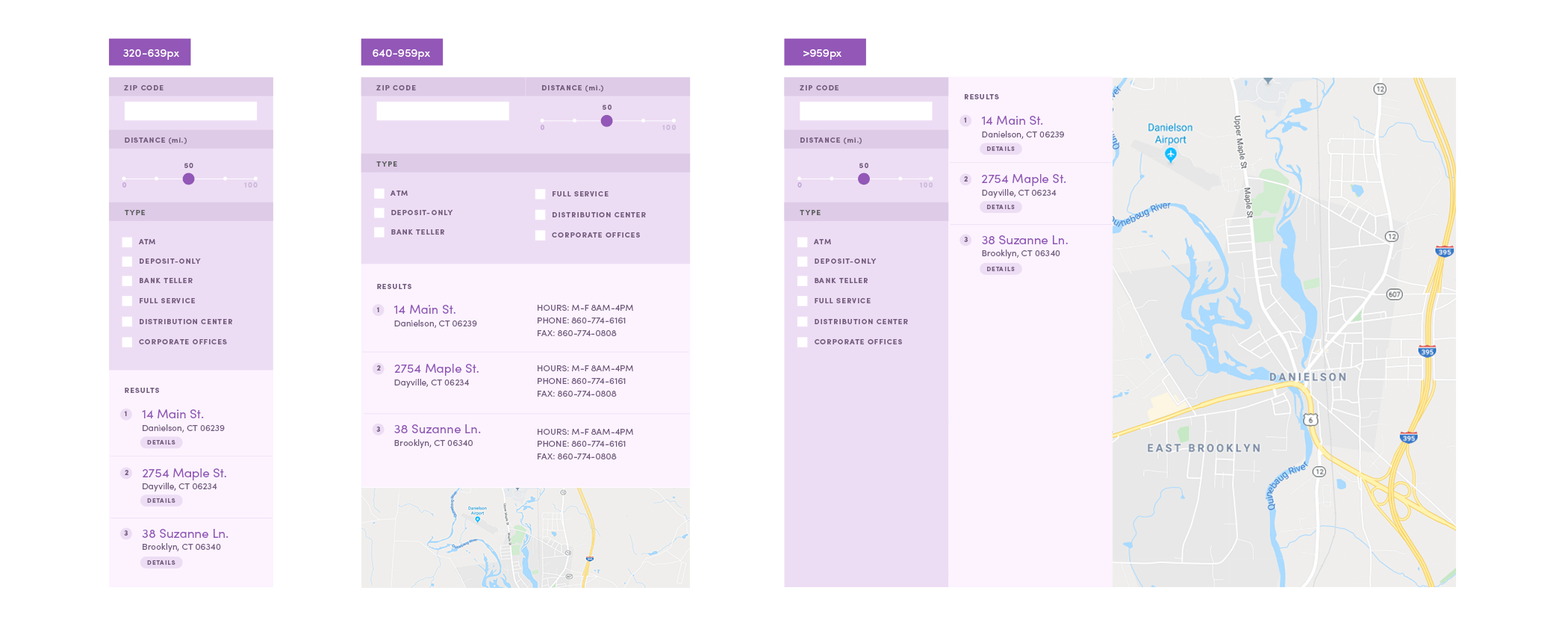
While a map-based branch location finder component could require many more subtle tweaks to make sure all the UI elements are easily accessible.

A medium-sized screen gets a map and more breathing room for filters and results, while a larger screen gets an immersive map-based experience.

A good organizing step for CSS in scenarios like this is to try to group each distinct, purposeful change to your component into its own mixin, sans the media query. Make sure to give each a concise, descriptive name.

// Default (narrowest) styles.
.branch-finder {
  /* ... */
}

// Mixins, each of which will modify the
// branch finder in some way.

@mixin filter-two-column { /* ... */ }

@mixin results-two-column { /* ... */ }

@mixin show-map { /* ... */ }

@mixin filter-to-sidebar { /* ... */ }

@mixin results-to-sidebar { /* ... */ }

@mixin map-large { /* ... */ }

Then, at the bottom of your component’s .scss file, list your media queries, placing only the mixins inside (no other messy CSS!):

// Responsive media queries for branch finder.
.branch-finder {
  @media only screen and (min-width: 639rem) {
    @include show-map;
  }

  @media only screen and (min-width: 639rem) and (max-width: 959rem) {
    @include filter-two-column;
    @include results-two-column;
  }

  @media only screen and (min-width: 960rem) {
    @include filter-to-sidebar;
    @include results-to-sidebar;
    @include map-large;
  }
}

This level of abstraction not only keeps things tidy, it lets you see the complete “story” about how your component changes as the target screen size grows. Instead of getting mired in the margin-and-link-color weeds as soon as you open the file, you can focus in on either the high-level media queries themselves, or individual mixins.

Another benefit of this technique is that it’s easier to keep your component looking right in a host of more tricky scenarios. In our example above, both the filter and results go two-column when given enough space, but ultimately end up back in single-column form when the largest layout forces them into a sidebar. Instead of needing to wrestle the two-column style back to one, the max-width in the media query allows the two-column styles to quietly slip out the back door.

There are no one-size-fits-all solutions, and there are always infinite ways to solve the same problem. However, you never know how long-lived or a sprawling a web project might end up being.

With the nature and complexity of today’s CSS, it’s always good to keep some of these organizational tenets in mind from the start, and the tools that make that organization easier close at hand.