Skip to content
06.04.21

Retrofitting Print by Evaluating Patterns

Most of the screen-based (don’t mind my reluctance to use the word “digital”; it sounds so 90’s to me) projects we work on are conceptualized from the ground up, or derivative of a previous version. But every so often, a team we’re working with has the goal of taking a print communication they’ve created and formatting it for the web.
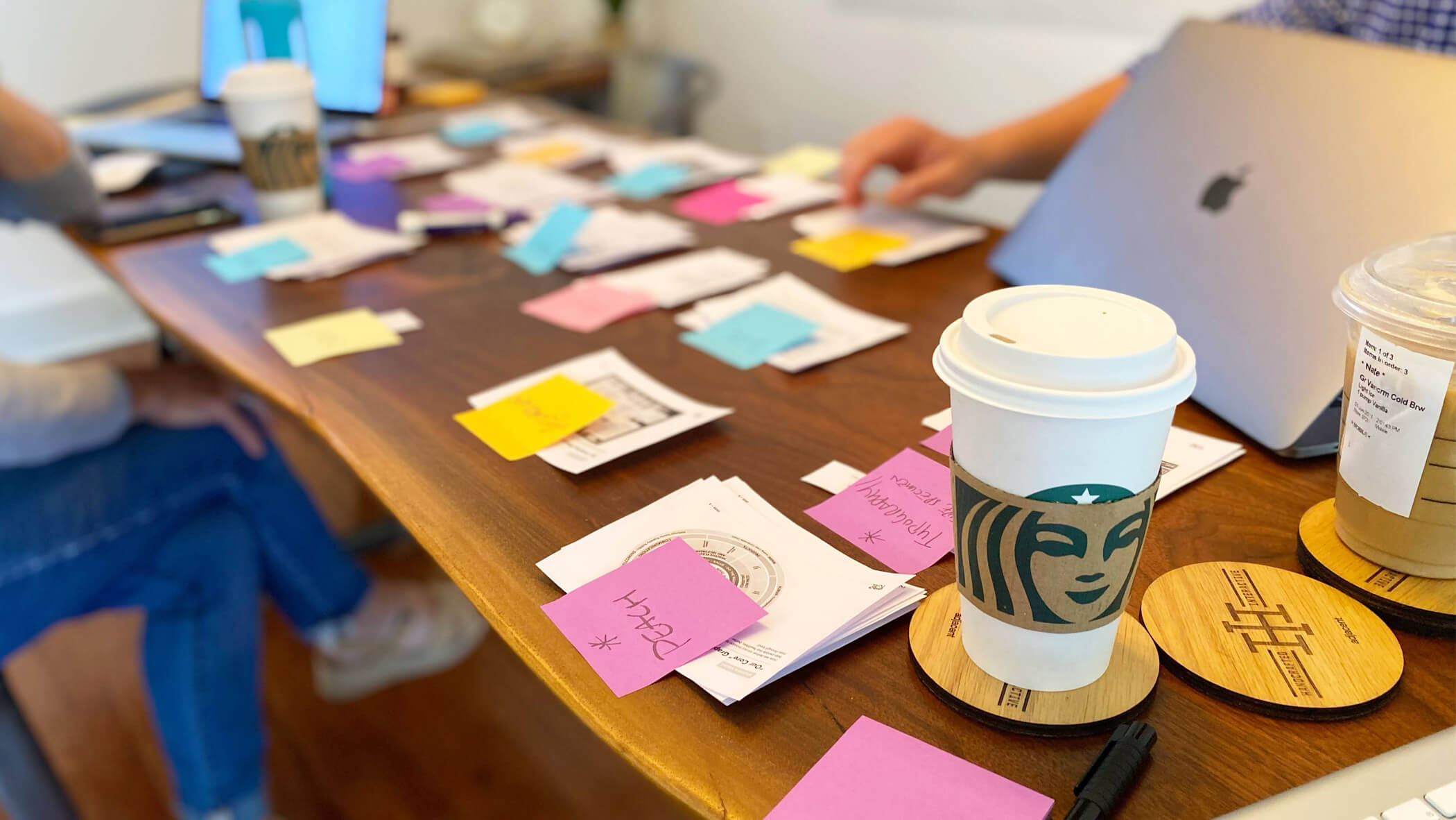
Maribeth and Nate work on grouping patterns in our conference room

The rationale is understandable: screen products are typically superior for circulation, access, and update-ability—or at worst case, the web version of a thing complements the print version simply by existing in one more format.

Often, the idea isn’t to unify the presentation across both mediums (thank goodness) but to interpret print ideas in ways that the web does best. While this sounds ideal, mapping printed content to digital (ok, I relent) patterns is messy, quite frankly.

We’ve done this a few times and found a two-part process that works fairly well:

Step 1: Workshop

Tools Required

Printer, scissors, Post-It notes, markers, large surface, and Starbucks. Plenty of Starbucks.

It’s possible the source material we start with is built on patterns, or repeated layouts for similar structures of text, images, etc. Even if that’s not the case, our first goal is to group like-content so we can get a sense of which patterns we’ll need and how flexible we’ll need to make them.

We believe the most effective way to pattern-ify is by cutting up printed PDFs.

The Future of Sports

Check out how we cut up The Future of Sports report and turned it into a system of reusable patterns

View Case Study

If you’re familiar with UI audits or Interface Inventories, this is the same idea taken off-screen. It’s certainly possible to do this in a Google Slides doc filled with screenshots, but there’s something collaborative, tactile, and easy-to-assess when you have snippets of paper strewn across a conference room table.

As best we can, we divorce what we’re seeing presentationally in print from what we know about the content. Some of the hardest work is abstraction, though it’s critical to this process if we want to end up with a reasonable amount of patterns. Our chief goal is to eliminate any one-off elements or reduce those instances to a few, significant pieces of content we can build something custom for anyways.

Step 2: Document

Tools Required

Project management app, phone camera, whiteboard or pencil/paper

Once we’ve established what patterns we’ll need, the low-key MVP of this process is documentation. Naming the pattern is somewhat important, but something that can be changed later without much pain. The most significant work here is to record what each pattern needs to accommodate: a headline, description, photo, etc.—and which of those are required or optional. This gives our designers a common layout to sketch and it gives our developers the foundations for code structure and decision-making.

We use ClickUp as our PM tool and—not unlike others we’ve used—it’s easy to turn each pattern idea into a card we can move across a kanban board. We attach the required and optional fields, sketches, and comments as we work through refining each pattern. This is a workflow we also use as we build components for all our sites and design systems.

It’s all perhaps a bit “old school” or unconventional, but printouts and scissors help us generate reusable patterns for complex screen projects.

It can be daunting to look at an involved printed thing and strain to think what it’ll take to create an easily digestible web thing from it. The work is (literally) messy to get there, but it’s quite possible clarity is just an Epson all-in-one printer and a pair of Fiskars away.

More Unconventional Methods
Dan Rose
Homepage Last
Dan Rose
On Nimbleness