
So much of the language we use can sell in — or under-serve — our visual ideas, making the words we use of critical importance. This is a skill that is far too often underdeveloped, speaking from personal experience. Instead, I often find myself relying on “crutch” phrases that sound nice but lack specificity and meaning. Takes one to know one, they say.
If that too sounds like you, fellow designer, there’s hope. If we can identify the shortcomings of these kinds of words, maybe we can become intentional in finding alternatives:
When It Has Too Wide of a Range of Interpretation
If we were in a classroom of words acting as students, “clean” would be flagrantly raising its hand to volunteer here, shouting PICK ME PICK ME PICK ME.
Here’s an example of where using clean to describe a type of layout left me confused recently:
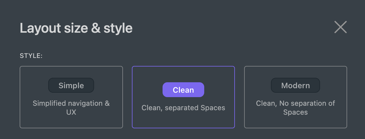

Clean is, assumedly, tidy and well-organized. The trouble is, a designer can use any number of approaches to accomplish their version of cleanliness: straight lines, high contrast, generous whitespace, consistent alignment, and so on. Yet, for some, clean is less about the quality of a thing and more about the amount of it:
- Straighter lines or fewer lines altogether?
- High-contrast colors or fewer colors altogether?
- The size of the whitespace or the lack of content?
- Tighter alignment or fewer things to align?
And so, some interpret clean as order and others as minimalism. Might those be more descriptive starting points?
When It Lacks a Viable Opposite
Many design briefs start like this:
“We want an easy-to-use, authentic, and approachable…”
Suffice it to say, shouldn’t we all want those things? Does anyone want a hard-to-use website or a disingenuous brand identity that turns people away?
For me, design principles with viable opposites have become a trustworthy way to capture organization- or brand-specificity in a project. Is it more on-brand for us to be technical or layman? Punchy or restrained in our use of color? We gain a semblance of uniqueness when we substitute platitudes for characteristics that require a stance.
When It Has a Completely Different Meaning Outside of Design
Anyone around product design in the past decade has had their fill of the term “MVP”, though it’s certainly a credible idea. In design circles, an MVP is the Minimum Viable Product required to provide value to an audience.
Yet, to someone unfamiliar with this context, an MVP is the Most Valuable Player (hopefully this year it’s this guy). It’s not a stretch to assume their interpretation might be to use the term as a metaphor for the most important element within a design.
Heck, I think this entire article is attempting to draw us toward better MVPs (Minimum Viable Phrases 🤓).
Acronyms are troublesome when we don’t take the time to establish what they are, or provide a reasonable reference to their definition within our context. PIM, DAM, UI, UX, CMS, and more may seem second nature to design practitioners, yet they can alienate outside audiences if we assume we’re talking about the same thing.
When It Requires Too Much Expertise
As someone who often confused “modern” for “contemporary” in art history class (and vice versa), the former term can be a category as much about expertise as it is style. If our baseline of modern is “in keeping with current aesthetics”, it becomes subjective to one designer’s perspective on what qualifies as current aesthetics. Would another designer agree? A client?
While much of this can be further defined by the expert, there’s a potential chasm here. If modern is now, and retro was then, what’s sitting in between that? Outdated? Is outdated ever viable? What happens when it’s modern to be retro?
Could we, instead, substitute the defining qualities of a modern approach — recently, it’s perhaps simplified, flat, high-contrast, etc. — as the label itself?