Skip to content

Setting the Table for Rich Storytelling

Case Study
Website Redesign
As you’d expect, a 130-year-old company in rural Minnesota has some stories to tell. What they needed was a digital platform to help amplify them.
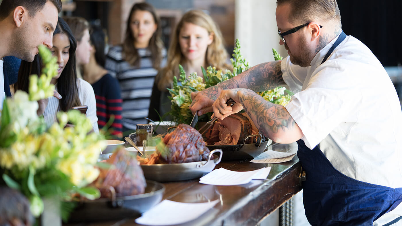
Hormel Foods Curemaster ham event

Admittedly, our initial impression of Hormel Foods was similar to most: a company whose SPAM™ and Hormel Chili™ products lined the pantries of our parents and grandparents . A few trips to the Midwest changed our perspective profoundly.

237
Stories Published
61%
Increase in Mobile Traffic
55%
Page Load Speed Increase

A thorough Discovery unearthed the desire, internally, to tell the Hormel Foods story and change the perception many like us had come to accept.

This Fortune 500 company hadn’t, in fact, been mired in the past—rather, it’d been at the forefront of accruing health-conscious brands (Applegate, Jennie-O, and Justin’s, just to name a few) and promoting corporate sustainability and responsibility amongst the world’s most admired organizations. Behind their perhaps unexpectedly vibrant products were genuine, creative, and capable people.

This was an opportunity to convey the heartbeat of a future-focused global food company.

In This Case Study
  • Chapter One Story Inspired and Immersive Narratives
  • Chapter Two System A Confident, Yet Approachable Visual Language
  • Chapter Three Roadmap Empowering & Encouraging Site Editors
  • Chapter Four Results Helping to Change Perception
01

Story

Inspired and Immersive Narratives
Chapter One

The idea for a signature, human-interest platform within hormelfoods.com gained momentum early on. With a team of writers within Corporate Communications, an in-house production studio, and strategists from Attention Span Media, Hormel Foods was well-equipped to pull it off, too.

Fittingly, the identity and scope of the section got its roots from the company’s purpose statement: “Inspired People. Inspired Food.”

Making It Compelling

We had immersive assets, but what makes for an immersive reading experience? You know, the cozy-up-to-a-magazine kind of experience?

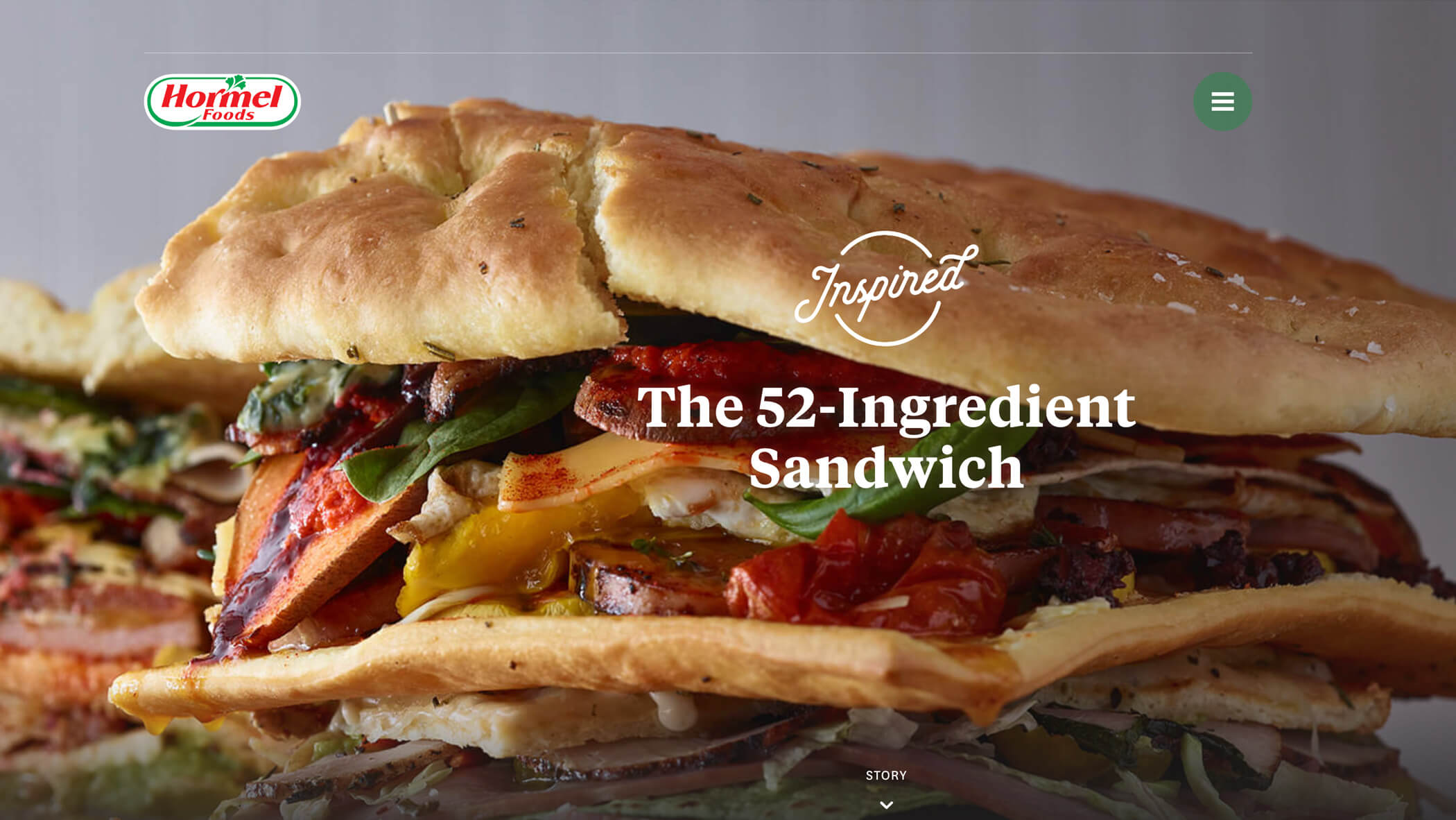
We homed in on creating emotional appeal through full-browser “cover” photos and a comfortable reading experience with generously sized type. Often on the web, an engaging composition at the start of an article can be overlooked, so we opted to keep the cover photo in view while you’re reading the article.

02

System

A Confident, Yet Approachable Visual Language
Chapter Two

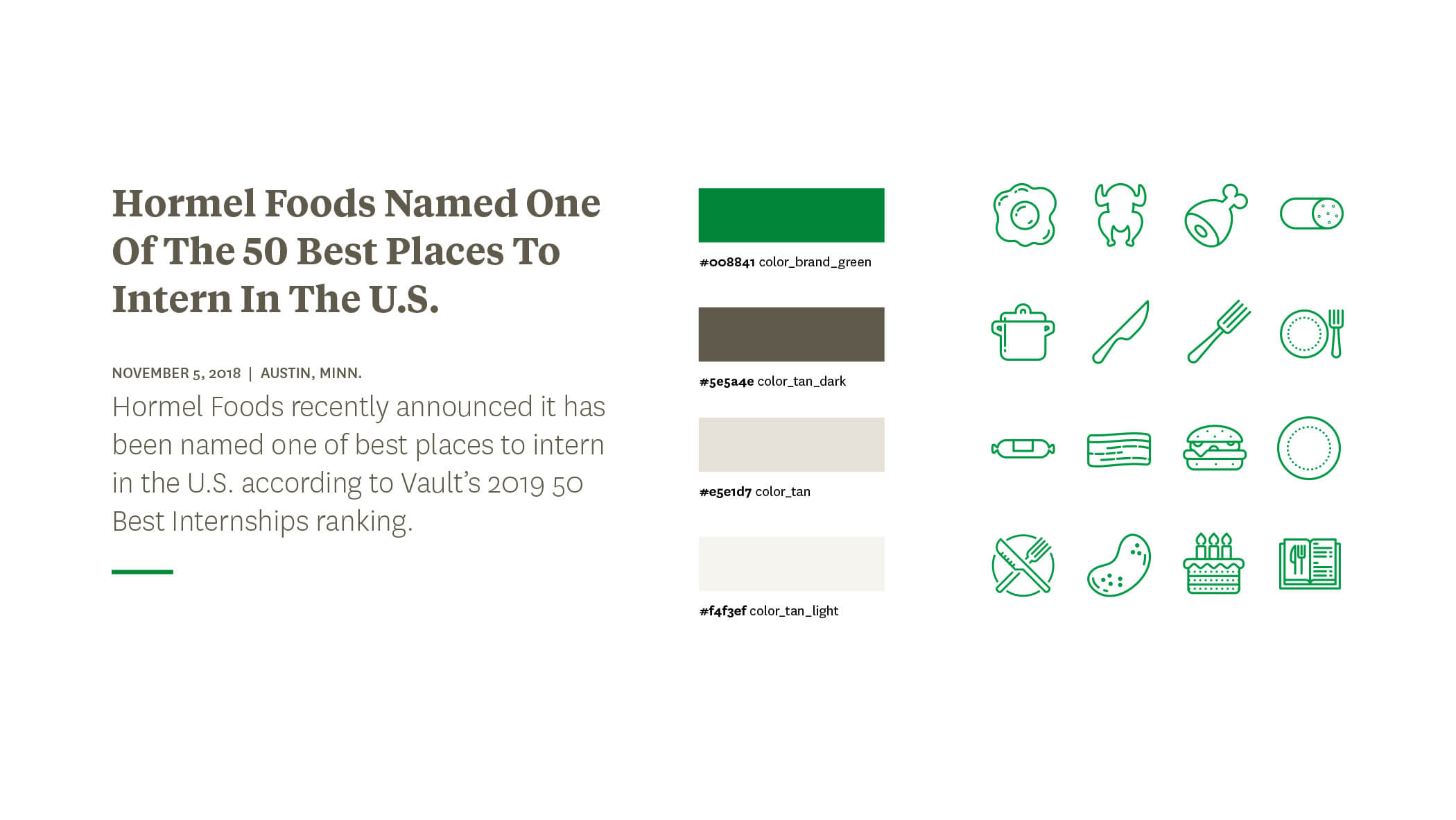
A company as hardworking as Hormel Foods needn’t work hard visually. The redesign was a golden opportunity for the brand to promote consistency, confidence, and simplicity on the web. Our efforts resulted in a reliable design system that embodies the attributes of the company.

Hormel Foods is comprised of 20,000+ talented employees worldwide, and we’ve never gotten the sense that a single one of them wasn’t downright Minnesota Nice. We found Tiempos Text embodies this character of approachability quite… nicely.

Speaking of clarity, holy smokes were we impressed by their treasure trove of photos.

They’ve got some serious food photos we encourage you to check out on anything but an empty stomach. It was crucial to present these images as heroically and unfettered as possible—the minimal UI styles echo this sentiment.

03

Roadmap

Empowering & Encouraging Site Editors
Chapter Three

With the team at Hormel Foods poised to make daily updates post-launch, we employed a three-tier strategy for supporting site editors: 1) high-level instructions within WordPress, 2) contextual guidelines when editing pages in WordPress, and 3) an interactive style guide.

Who wants to stop what they’re doing and dig through emails just to find out what size an image should be? How do you know when a headline is too long? Contextual guidelines meet site editors in their time of need by providing quick hints next to input fields. Comes in handy when you have a site containing over 20 customizable content types.

Sometimes those brief hints don’t provide enough rationale to help a site editor decide between using an Accordion or a Gallery. Enter our interactive style guide, coincidentally named Cookbook—complete with notes on art direction, use cases, and image templates. Should roles change or new team members be introduced, Cookbook’s ready to onboard for a smooth transition.
04

Results

Helping to Change Perception
Chapter Four

Hats off to the corporate communications team at Hormel Foods for orchestrating the redesign effort. Their unwavering commitment to design and content throughout the process helped transform hormelfoods.com dramatically. The same is true post-launch, and it’s incredibly rewarding to see how the site’s empowered them to tell stories beyond what you’ll typically find in their industry.

Thanks to your incredible team, Hormel Foods couldn’t be more proud of its world class website! #inspiredbyadjacent

Wendy Watkins VP, Corporate Communications
More Projects Like This
The Future of Sports
Keeping Pace with Futurists
Strategic Financial
Investing in Personality