Skip to content

Keeping Pace with Futurists

Case Study
Editorial Platform
“Bold” isn’t just predicting what the world of sports will look like next year. It’s a report telling you what they’ll look like in 2040.
Crowd in stadium

With a hook like that, we happily took the bait when Tyson Law asked us to help with The Future of Sports. Fueled by “futurists”, the project is composed of research and interviews on topics such as stadium experiences, athletic training, advertising, and the growing popularity of e-sports.

The Future of Sports is an initiative between the media strategists at Attention Span and Delaware North, a leader in event, retail, and gaming experiences. Delaware North operates more than 60 major sports and entertaining venues (think: Wembley Stadium) and is owned by the Jacobs family, owners of the Boston Bruins. So, yeah, these people know a thing or two about the industry.

21
Topics
First Published
2015

Even from the outset of the project, we knew future versions of the report would be published. We had to make smart, flexible decisions that wouldn’t come back to bite us later.

We began our mission of digitizing their printed report like anyone would—with a pair of scissors.

In This Case Study
01

Component-ization

Finding Patterns on Paper
Chapter One

Though we strive to make sure each project we take on has its content in order from the start, rarely is that actually the case. Imagine our delight when we were presented with this:

Printed Future Of Book

While it’s possible to emulate the design aspects of the printed report verbatim, we were drawn to the opportunities of fully embracing the web as its own interpretation. There, we could push scale and deliver interactions to help emphasize important content.

But first, sorting the content.

There are many benefits of identifying content patterns before designing components. We started defining relationships between (literal) snippets of quotes, charts, tables, and some key predictions. While this wasn’t unlike our normal process of poring over site content in Google Docs, the tactile representation of content made the task oddly satisfying.

Across the site, we evolved these content types into consistent yet flexible components. Our goal was to maintain continuity with the book while using opportunities to highlight content with subtle changes that would pay off on-screen.

02

Future-Friendly

Designing a System For Future Reports
Chapter Two

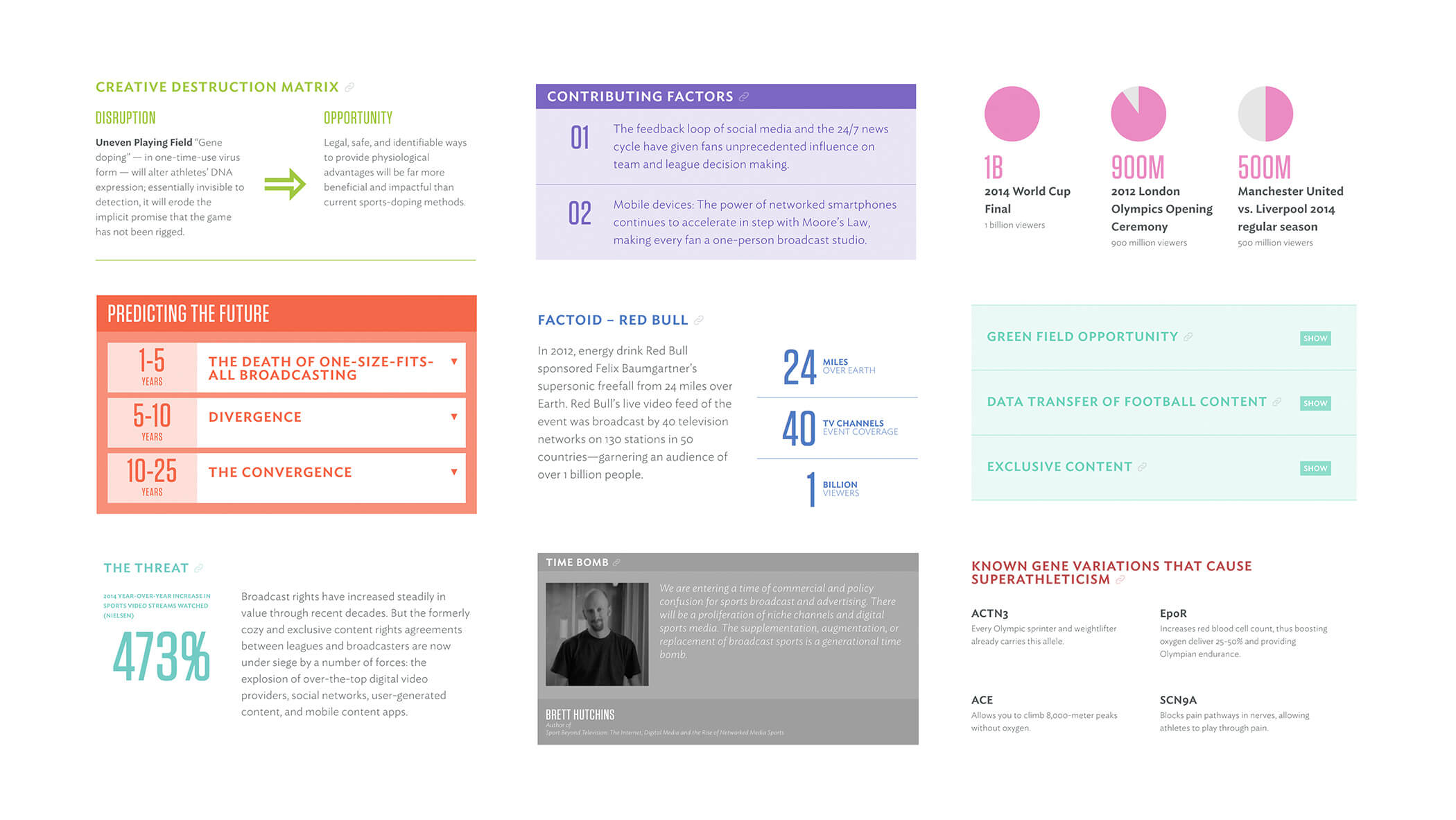
As reports are published, it was our intent that the design facilitate organization. Though there’s a high-level narrative being threaded, each report spans 10-15 topics that, at times, only loosely relate to one another. To create contrast between sections, each topic is assigned a unique color in WordPress. To unify the sections, the layout of each component is consistent.

Using WordPress as a base, we built layers of custom fields, administration UI, and logic to not only enable efficient management of the site, but also the ability to create entirely new sections and substantial rearrangements.

Every small block of content, or component, in the site comes with its own interface in the administration UI to help ensure consistency. In order to accommodate social media campaign drives, we made every component reachable at its own URL, while also linking to the main page in which it normally lives. No duplication of content, just smart coding.

More Projects Like This
Attention Span
The Future of Medicine
Hormel Foods
125th Anniversary