We’ve discussed how connectivity plays a key role in making our pages look like pages again. The challenge, however, is that connectivity needs to be communicated in an effective way so that our teams can trust that everything will work together.

This sounds a whole lot like page comps, the unlikely hero this story deserves.
For: Us, From: Us
Ever since Photoshop Etiquette, I’ve had a difficult time making peace with labor-intensive static comps. Part of my hangup is the level of accuracy comps require, which has everything to do with their intended audience. Through no fault of their own, stakeholders will be quick to point out when content isn’t quite right, and developers will be quick to ask about intended responsive behavior. The resulting onus on the designer is to produce numerous page comps at multiple widths, inclusive of to-the-minute content, when all designers are really hoping for is buy-in on aesthetics.
To be clear, you might see value in page comps for addressing the above, and that’s ok! At Adjacent, we’ve pivoted to shorter explorations that focus squarely on style, allowing content and layout to be explored in other formats. However, if there’s an audience not being considered in the page comp equation, it’s ironically designers.
It seems weird, but would you consider making page comps for yourself or other designers on your team? If so, when would you do them? What liberties would you have?

Lately, I’ve been able to answer these questions accordingly: Why not/literally anytime/all the liberties.

When paper sketches and dev tools aren’t making the right connections, page comps usually do the trick.
For me, static comps not only allow for experimentation and expression in ways I can’t quite pull off designing in the browser, but they also provide a chance to assess how components fit together at the page level. A large part of my role is being confident in the recommendations and direction I provide; page comps provide a considerable “gut-check” for how these pieces fit together, even if mine is the only gut being checked.
Comping traditionally happens on the cusp of development. But in this version of the story, comps can happen when I need them to—which is great because connecting components seems like a here-a-little, there-a-little effort. If I’m the only audience, the only thing stopping me from messing with page comps is having enough pieces established to comp with. Be it as early as style exploration or as late as the launch party (don’t wait that late), comps can happen at any time, which means gut-checks can, and should, happen at any time.

The freedoms of comping for designers are many, because the expectations are different than that of stakeholders and developers. I really dig this sentiment describing “half-baked Sketch comps” from Adam Stoddard’s “Death to Process Machines“: “Notice how none of them are fully baked? It’s because they don’t matter! These aren’t for a client presentation or for developer handoff. They’re there to help me figure something out, then they’re trash. Investing time to polish them would have been a total waste of effort.”
Content accuracy? I’ll ballpark it. Thorough responsive behavior? Only if it helps me. If comps don’t need to be pixel-perfect, I can use them as high-ish fidelity sketches. That’ll help me focus on stitching elements and little else since prototyping, brief style explorations, and designing in the browser handle the rest. When it comes to page comps, polish can be the enemy of progress.
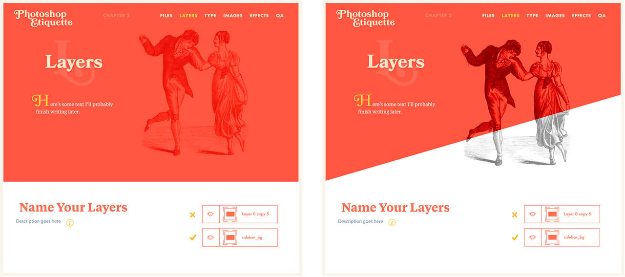

Here’s me throwing copy accuracy and text alignment to the wind, because I really just need to figure out if this angle and image overlap is going to work.
Living Style Guides
Though it seems like black magic, it’s entirely possible for code to talk to and inform a static tool these days. When this is the case, we’re not limited to the components from one page, since we have access to all of them. The best part? Even Page Layers won’t bundle things up as nice and neat as Sketch symbols do, which can save enough time to make it worth considering.
In this scenario, there could be benefits to having a shared kit of elements amongst a team of designers, enabling multiple perspectives to experiment with page-level decisions without each member needing to painstakingly create their own set of components. Good news, again: pretty much every static design or prototyping tool has a “library” than can be shared: Sketch has symbols, XD also has symbols, Figma has components, InVision Studio also has components, and Photoshop has Creative Cloud Libraries. At the moment, Figma seems to boast the most powerful component control options, but a case can be made for Sketch and XD.
Better yet, tools are becoming available that allow static tools to communicate with style guide code, and vice versa. React Sketch.app and Invision’s Design System Manager are good examples of folks trying to connect our efforts.
Even so, I kind of prefer the screenshot methods, which attempt to address an actual instance. While style guides in static tools are great, the starting point could be a blank page and lack of a realistic order of components to solve for.
In any case, if comps can be for designers, they can be efficient and useful when trying to create connectivity between components. The result should be more cohesive page designs without the baggage of traditional comping that precedes development. What was once viewed as an arduous exercise can be refreshing, especially for those who could use a gut-check to be certain components and page-level cohesion will pan out.
Landing the Plane
If you’ve hung in there for all three deep dives on this topic, I’m impressed by your commitment (and I hope this has been helpful)! While the discussion evolving around us seems to be “patterns, not pages”, I contend that both ideas have value—even if patterns is what should be prioritized, perhaps heavily. You might choose to start your process by designing pages, then derive patterns from them. Or, you could design individual components first, and if so, hopefully the approaches I’ve covered help you reintroduce page-level consideration.

I’m choosing to stay grounded in components, yet I’m resolving to use the best parts of page-driven design to help connect those components.