Let’s start with an example to better illustrate what I’m getting at. This page from target.com starts off with an impactful header. However, everything that follows seems to be individual components stacked one after another. Stylistically, everything works just fine (great, even). The size and number of items in each “row” of content establish a somewhat comfortable pace. Yet, I struggle to find any element that connects one content block or row to the next.

Here’s a different page on target.com that does attempt to connect content blocks visually. This thin rule outlines and navigates its way across and down the page, aiding the narrative of what defines “farmhouse” home decor style. The result is a more seamless, cohesive page than the previous example.
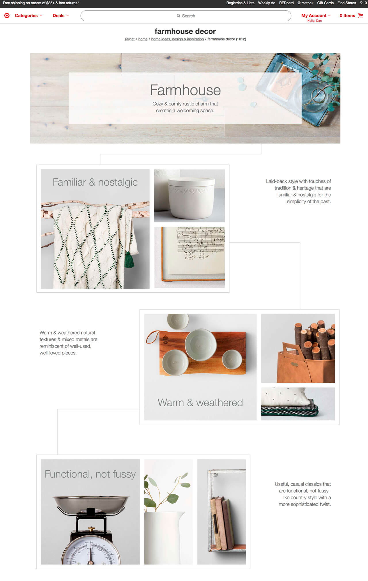

Farmhouse decor on target.com
Given a choice between the two, the latter example addresses my desire for a more cohesive page, and I imagine others feel the same. While I’m unsure of the specific processes that led to the creation of these two pages, let’s recount the benefits of each for those still on the fence:
Documentation
Components facilitate documentation more naturally than pages do. It’s kinda hard to provide instruction on how to use a one-off page design, right?
Documentation, of course, is critical to the long-term success and growth of a site. It’s no wonder that there’s plenty of pattern libraries and style guides popping up. As an industry, we’re seeing the benefits of providing our clients and teams useful instruction.
Consistency
Page design can, at times, compel a designer to produce slightly or altogether different designs for similar content types. Component-driven design tends to rein that in, promoting continuity and reuse.
Efficiency
A library of components (static or coded) can greatly cut down the amount of time and effort needed to spin up a new page. It’s the difference between making a sandwich with what you already have in your well-stocked kitchen versus buying all new stuff at the store.
Tools
Unsurprisingly, the toolset of a modern-day web designer has shifted to accommodate a component-driven process. Take a static tool like Sketch: arguably still a page-focused application, yet with the addition of Sketch Libraries and some serious upgrades to how Symbols work, it’s clearly pointing designers in a certain direction. Adobe’s XD Libraries follow suit, and even CC Libraries to an extent.
Page Wins
While the component benefits may not be breaking news to anyone, an exclusively component-focused process has its drawbacks. In fact, some designers still lean heavily on a page-centric design process.
Let’s take a look at two of the most appealing parts of this approach:
Layout & Balance
As I led off, component-based layouts can show their seams at times, appearing disconnected. Designing pages can be used as an attempt to safeguard this. Often seen as providing “big-picture” perspective, page layouts can be used to identify where two blocks of content—and more importantly, the transition between them—aren’t harmonious.
Buy-In
Perhaps the original intent of page design was to provide a reasonable facsimile of what a coded site would eventually look like. Besides serving as the “standard” for developers, page comps can be used to get stakeholder buy-in. Without additional documentation that takes the shape of a page (templates or prototypes, maybe?), exclusively focusing on component design won’t typically produce an accurate “preview” of a finished site. Much more to say on this later.
The Well-Constructed Page
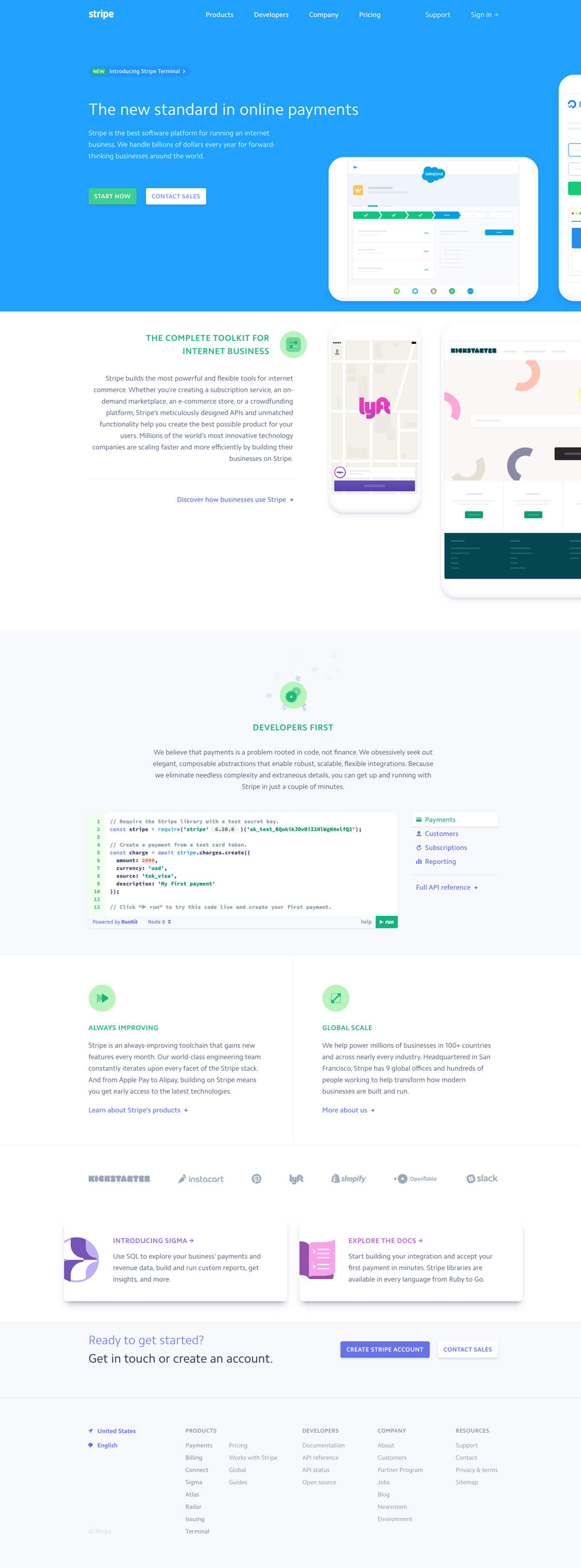
It’s fair to question the assumed inefficiencies of a compellingly designed, highly art-directed, cohesive page-based design process. However, it does tend to force designers to consider compelling visual elements and layout. Case in point: stripe.com
The site uses vivid gradients, background angles, overlapping elements, and image rotation to pull off a unique initial impression.

When I look at this, I get a sense of motion and energy from the background elements. The overlapping, rotated devices lead me into the next section of the page. I’m led to believe that this is a page constructed around a narrative—that one piece of information leads to the next in a meaningful way.
Now, check out what happens when these four elements are missing: