Simplicity Enables Clarity
I’ll begin with the countless stories—shared among those of us who are old enough not to be considered digital natives—witnessing with shock and awe the incredible ease with which our children (toddlers, even!) first-time, and absent of instruction, effortlessly navigate the iPad. This experience fully confirms my belief in the Steve Jobs adage that people don’t really know what they want until you give it to them.

In recent years, we’ve experienced a paradigm shift both in business and society that is undoubtedly due to the influence of companies like Apple, Google and others who are leveraging design in significant ways. The shift in thinking transcends all areas of these companies from products and hardware to interfaces and marketing materials, down to the smallest customer touchpoints. Design is paramount.
If we look at modern UX/UI design through the lens of this shift, we can see the crucial and interconnected roles that simplicity and clarity play. Common among design-centric companies are products and software that allow users to find and consume information quickly and intuitively, facilitate task completion and provide delightful experiences along the way.
Design’s One-two Punch
Simplicity is achieved by limiting options and focusing on user goals—a streamlining of sorts, that usually results in a reduction of elements. With an eye toward clarity, the challenge then becomes defining how those remaining elements are presented.
Clarity—defined as the quality of being coherent and intelligible—relies on organizing and grouping visual elements in a way that conveys a desired message and leads to desired actions or outcomes for the user.
Then and Now
Comparing the home page of the GoDaddy website from 2005 to that of present reveals a dramatic shift in thinking. How a focus on clarity and a human-centered approach create a wildly enhanced user experience.


In 2005, GoDaddy unearthed seemingly everything offered through their site on the home page. An overwhelming visual assault: lists and columns, buttons and links. Icons, logos and offers abound. Information that’s relevant and important, one could argue, but from a user’s perspective, dread and panic ensue upon arrival at so many choices. Met with so much information and complexity, it would be a safe bet that most users experienced frustration and confusion, and spent an exorbitant amount of time just searching for their task, let alone completing it. While others, utterly overwhelmed, undoubtedly abandoned their mission altogether.
The term “information overload” was coined in 1964 in the work of Bertram Gross, Professor of Political Science at Hunter College. He defined it as follows:
“Information overload occurs when the amount of input to a system exceeds its processing capacity. Decision makers have fairly limited cognitive processing capacity. Consequently, when information overload occurs, it is likely that a reduction in decision quality will occur.”
The same site today employs very different tactics.
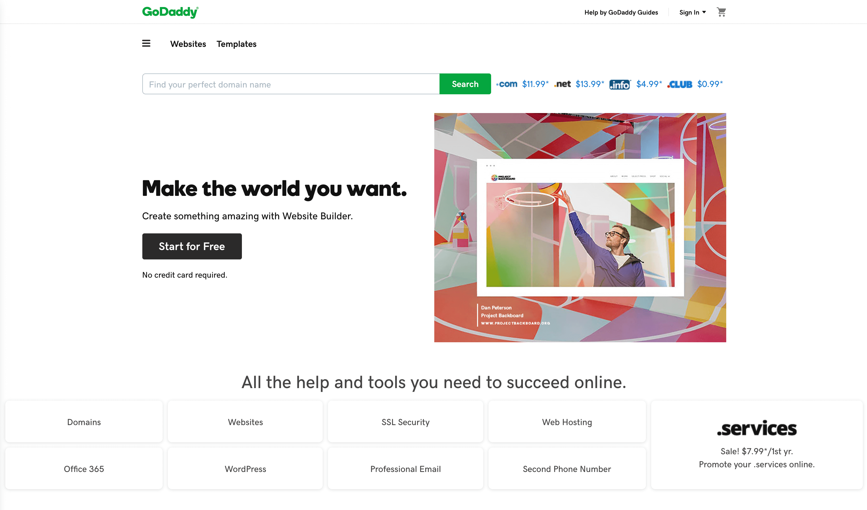

Ah, relief upon arrival! Minimal options with a singular priority elevated above all others. Following in priority with a large visual feature and clear call to action. Below, third-level tools and services. Navigation is clean and minimal, and overall tone is fresh and inviting. The result, a drastic difference.
The Old KISS Adage
In his post on best practices for mobile form design, Nick Babich discusses how a streamlined approach to information and choices is especially important in form design. He outlines the two key factors that have a major impact on completion rates:
Perception of complexity
The first thing users do when they see a new form is estimate how much time is required to complete it. Users do this by scanning the form. Perception plays a crucial role in the process of estimation. The more complex a form looks, the more likely users will abandon the process.
Interaction cost
Interaction cost is the sum of efforts—both cognitive and physical—that users put into interacting with an interface in order to reach their goal. A high interaction cost can be especially devastating for the online retail model which has an ultimate reliance on task completion. Easy, frictionless experiences can make all the difference, turning casual browsers into buyers, and satisfied buyers into repeat customers.
We’re Only Human After All
As designers, we have a significant challenge placed before us. Luckily, we’ve also got a plethora of knowledge and time-tested principles at our disposal to aid in the pursuit of clarity in our work.
Being human, we’re all innately wired for certain behaviors, thus we can’t deny the role that psychology plays in the pursuit of clarity. Jon Yablonski’s super useful and beautifully designed resource “Laws of UX” provides valuable insights and key takeaways for UX/UI designers based on classic principles of design and psychology. The user experience itself a study in purposeful simplicity and ultimate clarity.
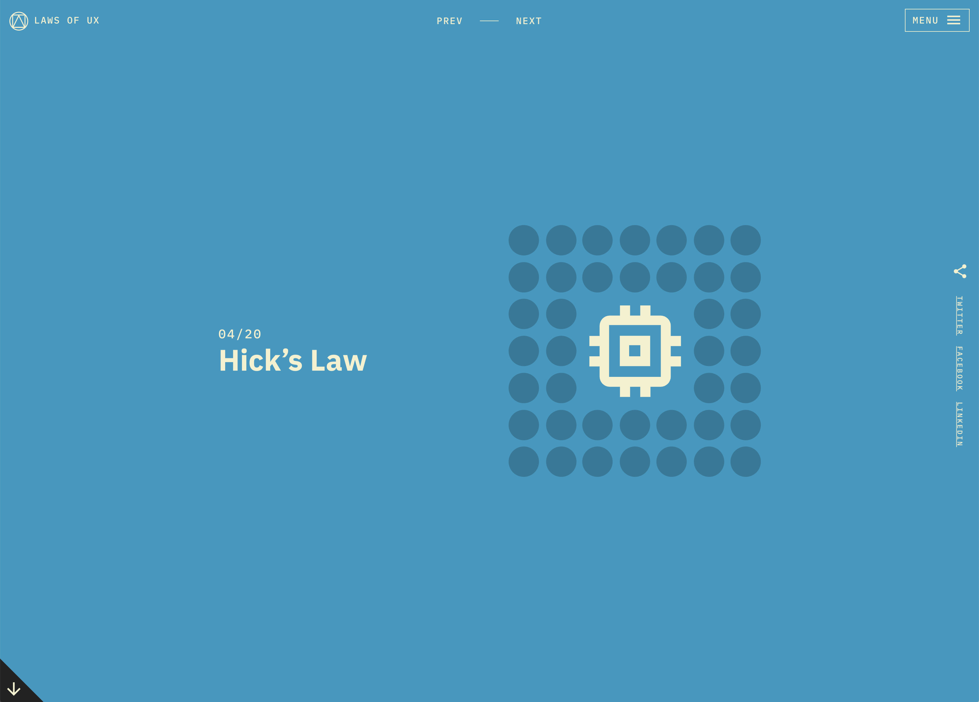

Hick’s Law predicts that the time and effort it takes to make a decision increases with the number of options.
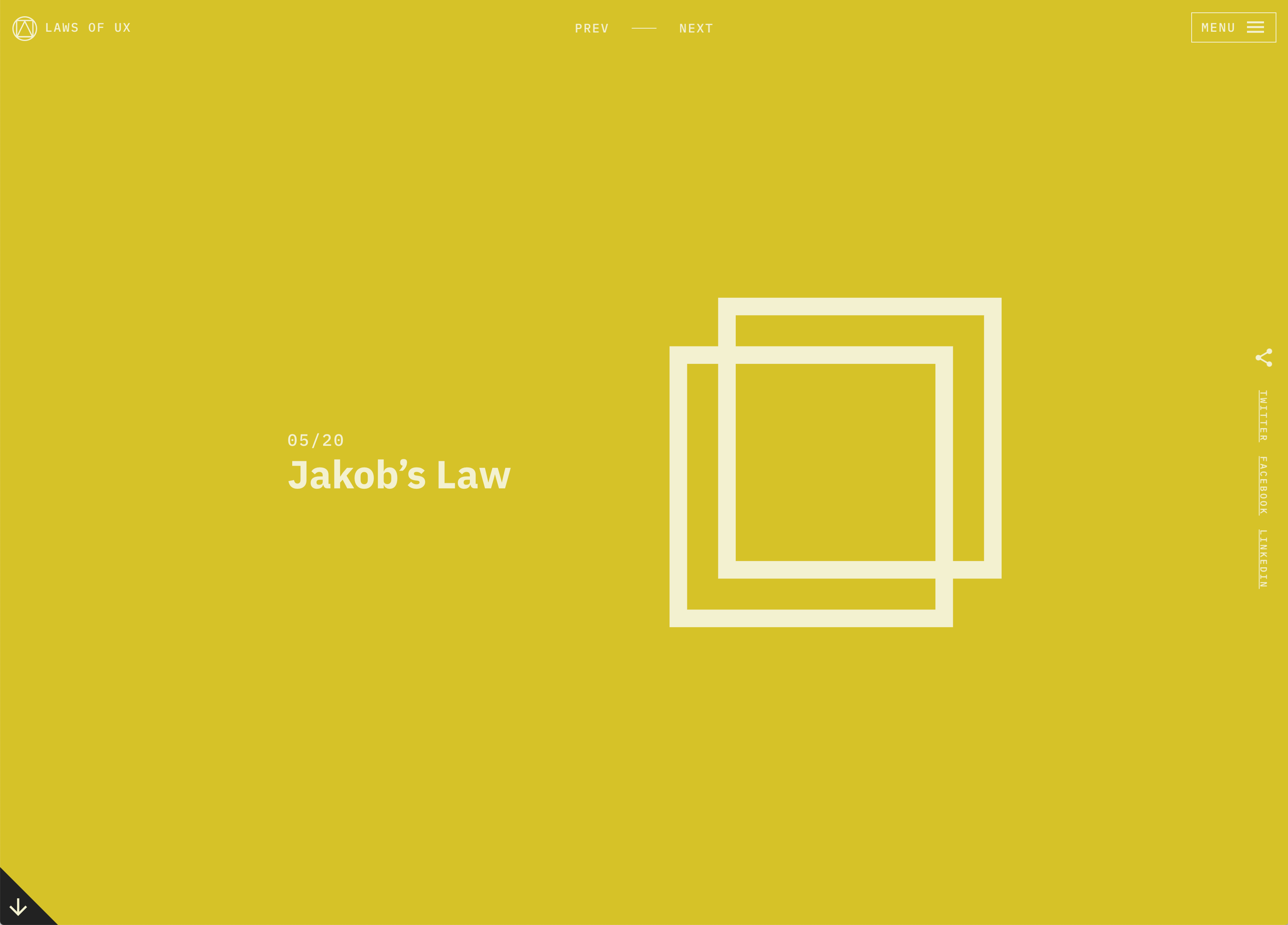

Jakobs Law reminds us that you can simplify the learning process for users by providing familiar design patterns.