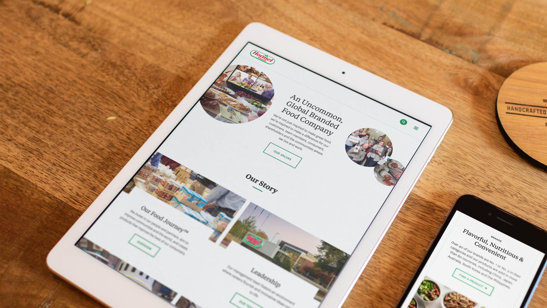
In late 2019, we noticed that two years of design system additions created more options for editors but oh-so-disparate styles. We ran an exhaustive audit to better highlight divergent paths, which provided the project team with the opportunity to further commit to clarity, accessibility, and an editorial style.
Through a series of focused phases (type, color, photo, icon, layout, and overlay adjustments), our teams worked to refresh the look and feel of the design system—and it’s primary product, hormelfoods.com—while avoiding significant foundational restructuring. The result? A timely redesign based on equitable styles and a more responsible, leaner set of building blocks to use across all extensions of the system.

