Skip to content

Making 1,093 Facts and Figures Fun to Read

Quick Recap
Campaign Report
Despite the economy’s rockiness from 2007 to 2012, Syracuse University donors joined together to raise over $1 billion. That’s a lot of green from a lot of Orange.
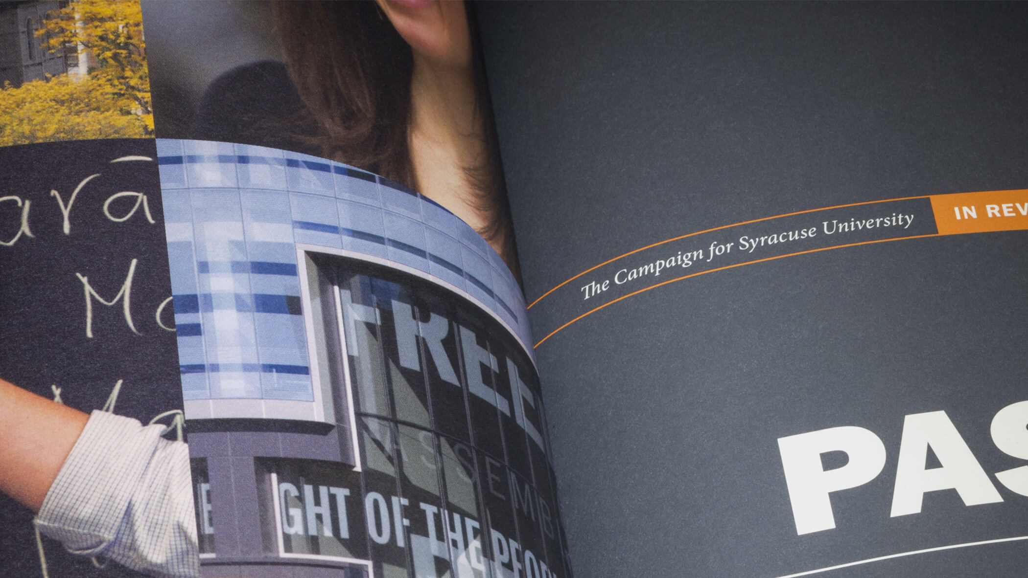
SU report inside cover

So how do you communicate this achievement in a way that does its impact justice? How can a presentation be as celebratory and as passionate as the donors it acknowledges? Default Powerpoint templates and charts seem to be the norm, but leave a lot to be desired, design-wise. Airplane banners make a nice impression but are short-lived.

Execution

Traditionally, printed annual reports tend to be incredibly dry in substance and even less appealing in appearance. Predictably, these reports—LaserJet-printed and stapled at the top left corner—aren’t all that inspiring. It’s a shame; at their core, annual reports have important information but the delivery creates a significant roadblock.

In collaboration with SU’s marketing team and writers, we created an extraordinary book that better served the content and messages within. It’s the publication by which SU’s donors deserve to be recognized.

This 60-page report tells the tremendous story of The Campaign for Syracuse University and the measure of its success. It showcases the impact of this significant fundraising effort through visually engaging charts, quantitative diagrams and typographic snapshots.

Let’s face it: these numbers are impressive. We wanted to present them in a way that makes them as heroic on the page as they are in real life.

We started by establishing the tone through a friendly-yet-sophisticated color palette expanded from the traditional orange and grays of Syracuse University. Similarly, we complemented SU’s brand typeface (Franklin Gothic) with notes of Minion Pro.

So often, vital facts and figures get lost in a stream of text. It was essential to develop at-a-glance, infographic data visualizations for key accomplishments.

This perfect-bound book was printed at Cohber Press in Rochester, NY on Mohawk Options paper. It lays/holds at a comfortable 9×12 inches, in part due to a smooth aqueous coating on the cover.

More projects like this
TURNING STONE RESORT & CASINO
The Commons at Turning Stone