Skip to content

The New Standard for Standards

Case Study
Brand Guide
We helped deliver a digital brand guide that allows easy access to up-to-the-minute brand materials from anywhere.
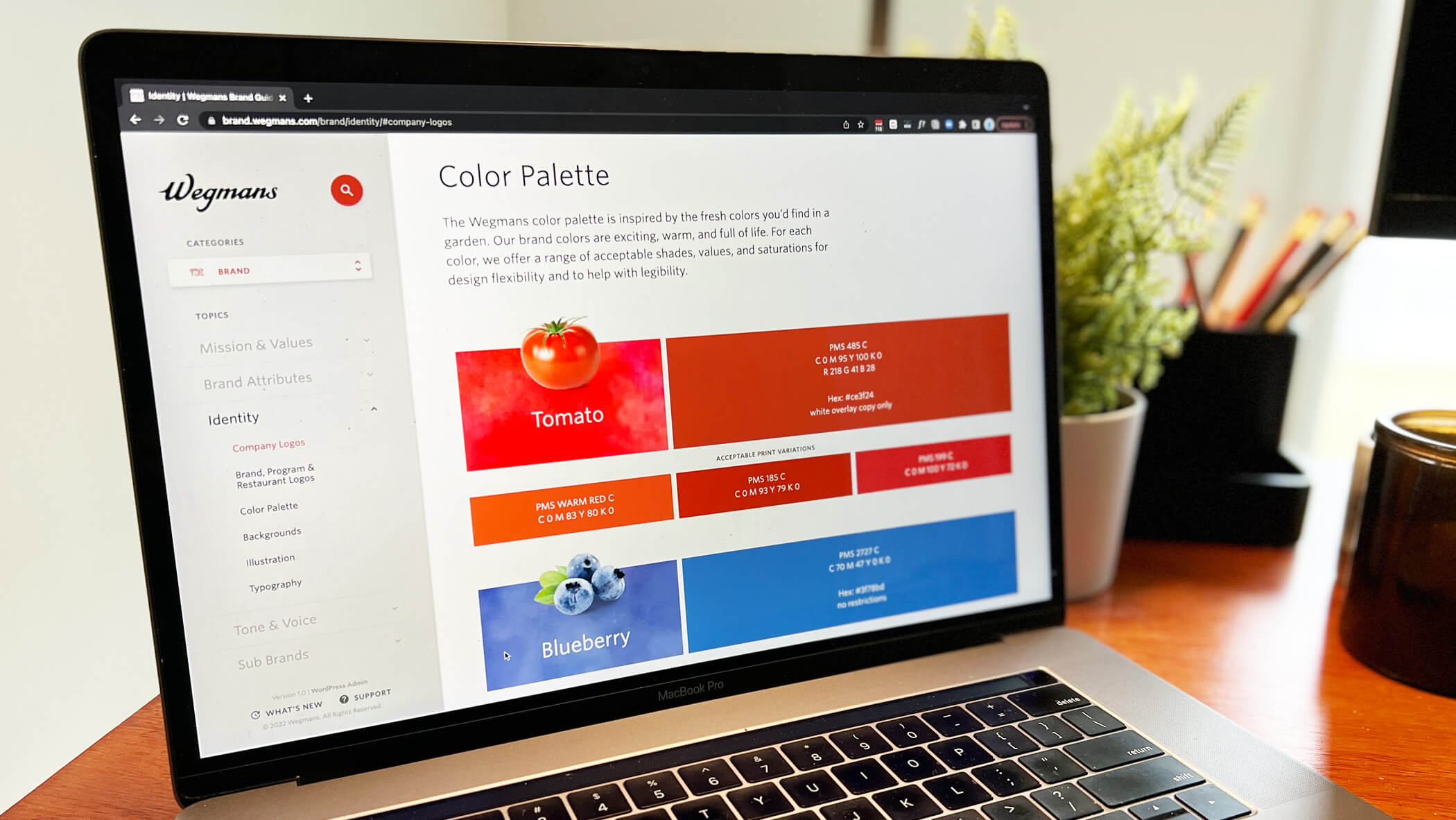
a laptop showing the wegmans color palette screen

One aspect of being everyone’s favorite grocery store is looking the part. There’s a guide for that, and we helped bring it to the screen.

Orchestrating a purposeful, consistent brand impression across 106+ stores, digital ads, and seemingly countless print applications is an ambitious task, to say the least. Like many organizations, our partners at Wegmans rely on brand guidelines to focus their efforts. And like many organizations, their brand guidelines were static: either in a printed book or a PDF.

Two things are true about effective brand guidelines:

  1. They’re living documents, needing constant updating and pruning.
  2. Just about everyone working for you needs access to them (mileage may vary).

We set a course with the Wegmans Creative Team not just to centralize these guidelines to the web, but to engineer an easy-to-edit WordPress experience that promises to take the pain out of changing a swatch color.
176
Topics Translated
01

Patternify

Finding reliable, repeatable commonalities
Chapter One

If you, too, spent your time in the 90’s cutting out magazines and creating collages, then this part is for you:

In print, “cohesive” often trumps “consistent” as designers lean into the affordances of the medium. On the web — and especially in a reference guide — consistent conventions are key to a clear user experience. The mission for our team was to unify subtle differences in the printed guide and identify common content types.

In what’s become an all-too-familiar studio exercise, we busted out the scissors and sticky notes and found an initial set of 10-ish patterns that could serve the guide’s content.

Ultimately, of the site’s 39 components, we make the most repeatable 17 available to compose pages within WordPress.

02

Shell Game

Creating clear navigation with momentum
Chapter Two

Style guides can be some of the thickest documents you’ll ever see, which really puts an emphasis on clear, sensible navigation. This isn’t an area you want to reinvent the wheel for, so we collected some heavy research to inform what the “shell” of the user interface should be.

We proposed many variations of a similar layout: on wide screens, left sidebar navigation with a scrollable vertical list. However, we did get fancy with the idea of what a “page” was: instead of paying a high interaction toll each time you choose a sub-topic, we stitched together sub-topics in one, continuous view. The sticky navigation keeps pace with the shifting content in focus, too.

03

Future-Friendly

Solidifying the guide’s ongoing success
Chapter Three

We led off this case study by saying brand guidelines need to be easy to update and access. Ensuring the former was squarely in our wheelhouse. We routinely modify the editing admin with Advanced Custom Fields and contextual cues that drastically decrease the amount of time editors need to be in WordPress. Entering, re-ordering, and re-formatting content has already proven to be a breeze.

Centralized access isn’t just inherent to the idea of a print thing being on the web — we made sure everything we designed and built was optimized for any size screen.

While our project team is confident the majority of use cases involve wide, desktop monitors internal to Wegmans, the guide doesn’t break down as screens get narrow — especially handy for in-meeting and between-desk moments. We’re always proud to embrace uncertainty, and a fully-responsive brand guide is another example of how we do so.