Skip to content

Embracing a Rich History

Quick Recap
Brand Identity
We teamed up with Bell Collaborative to create a logo & brand elements for Strange Design Public House. A labor of love and a lifetime dream, SDPH is destined to become Geneseo’s favorite ‘third space.’
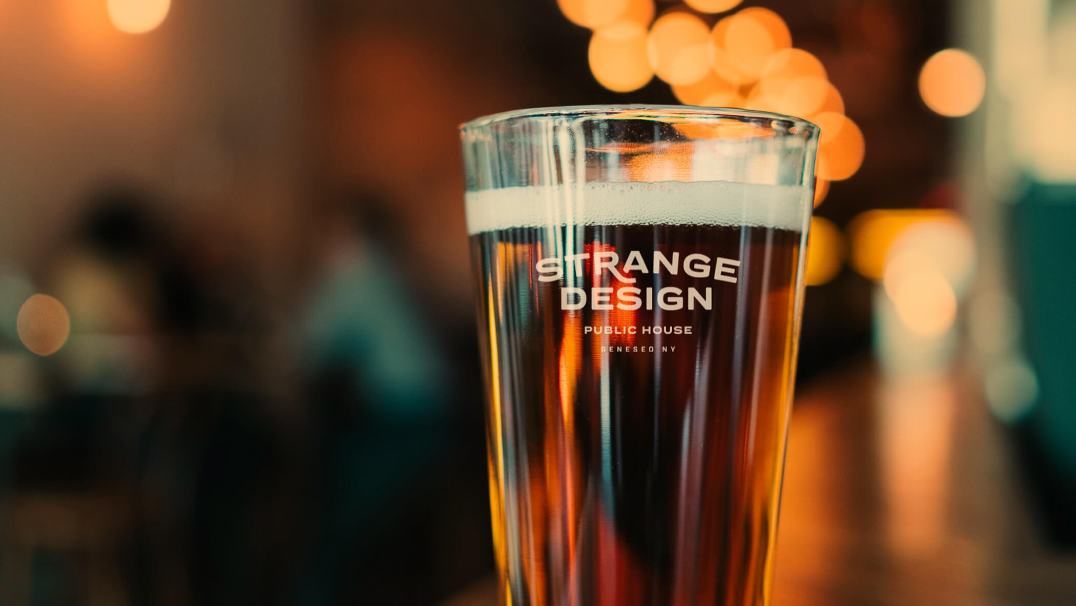
Strange Design Pint Glass

When Lisa Belodoff reached out to gauge our interest in working with her to develop a brand identity for a new brewery & restaurant (for her dear friends Tommy and Kristi Lee Streamer), she shared—quite literally—a napkin drawing. We were immediately intrigued. With a name like Strange Design Public House, the possibilities seemed endless.

Upon meeting the Streamers, we were hooked. Their story was charming, and the idea that they would build their dream by transforming a historic building that had once been home to a poor house was super inspirational. Restoring hope and creating a sense of community in a physical space with a bleak past is core to the Strange Design mission.

Inspired by the Phish song that bears its name, Strange Design Public House grew from a napkin drawing to reality. We were thrilled to have a part in that story, and to have the opportunity to work with the talented Kate Sonnick and Lisa and the crew at Bell Collaborative to bring this dream to life.
Primary mark

Abbreviated mark

Launching a new brand was an overwhelming task for us. Once we started working with Adjacent so many of our questions were answered. Their creative vision, expertise and desire to help us succeed, resulted in a brand identity that we love and can can grow with for years to come. Cheers to our new friends at Adjacent!

Kristi Lee and Tommy Streamer

Brand elements

Along with the core marks, we developed a few key brand elements that can be used in communications where the primary mark is present as graphic accents.

Badges

We created a set of badges for use in place of the primary mark in certain applications where a more graphic tone is desired such as merchandise and apparel.

Minimal (top) and expressive (bottom) badges

Brand color consists of a primary and a secondary palette

Typography

A set of primary typefaces was assigned to ensure consistency across applications. We also assigned a pair of expressive typefaces that can be used in combination with primary brand fonts and graphic elements for more spirited messages and applications.

Brand statements

Spirit Mark

The SDPH spirit mark was developed using brand elements and tailored specifically for use in small spaces or for merchandise and promotion.

In this historic space that was once the Livingston County Poor House and as Geneseo’s very first brewery and public house, we hope to create something rich. The feeling that all are welcome here. Everyone who enters becomes a part of this place, leaving their own strange and indelible mark.

Welcome, Strangers. Kristi Lee and Tommy Streamer
Similar projects
Identity & Branding
The Commons at Turning Stone
Identity & Branding
McClurg Rebrand