Skip to content
04.15.19

The Case for Simplicity

There’s nothing that screams summer like the taste of gorgeously ripe tomatoes on an August afternoon. One of my favorite dishes of the season is the simple yet mighty Caprese salad, made of just three things. Fresh mozzarella, home grown basil, and ruby red, vine-ripened tomatoes. (Ok, maybe four if you count the balsamic drizzle.)

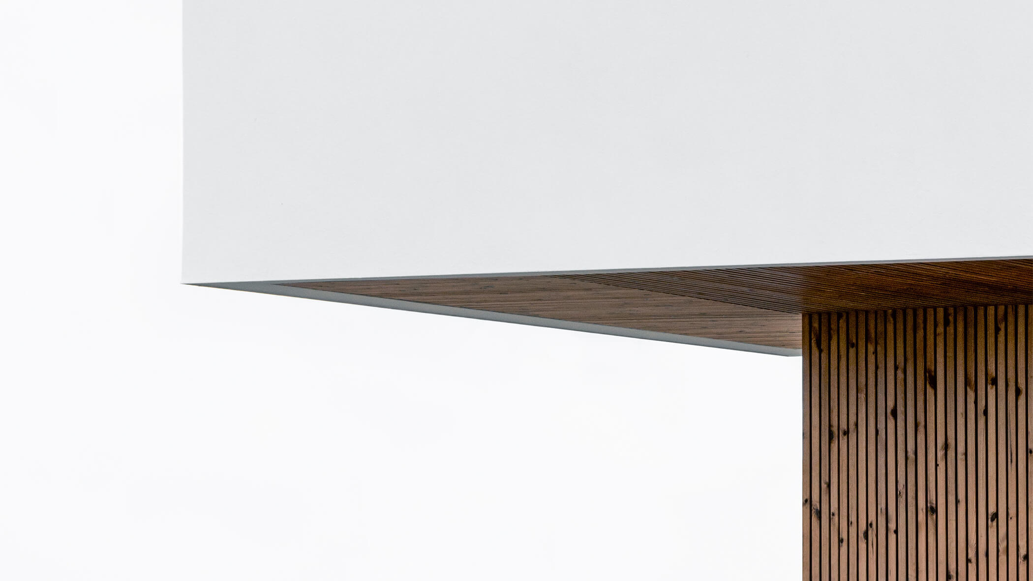
Image of modern building with sharp angle

The most amazing thing to me about this famous trio, is how the elements when combined, produce a whole new flavor experience. Also super cool is that their colors collectively represent the Italian flag. ;) The point being—elements working together to create something greater. Something so much more than the sum of the individual parts.

You can think about a lot of things this way. What is the most impact you can get from the fewest elements? In life, in music, in food? If we think about simplicity in design—many of the same principles apply.

Clarity and restraint are hallmarks of simple and purposeful design. Both qualities that can set a piece of visual communication apart in a sea of sameness.

Making the simple complicated is commonplace; making the complicated simple, awesomely simple, that’s creative.

Charles Mingus

Simplicity is a Choice

Simplicity is not a style, but rather a philosophy. Just like non-essential elements in our lives can rob us of our mental peace and balance. Extraneous visual elements can tend to work against the goals of harmony and clarity in visual communication. Restraint—the conscious choice to strip away elements that aren’t absolutely essential, places enormous importance on those that remain. “Less but Better” is the way Dieter Rams states it. “Good design is as little design as possible.”

Good design is as little design as possible.

Dieter Rams

I’m constantly inspired by designers and firms who have a solid grasp of the power of simplicity in their work—finding beauty in form rather than ornamentation. The choice to design simply requires confidence in a strong conceptual direction, and the ruthless editing and final execution of that concept. All that remains must be absolutely essential. Let’s take a look at a few—that in my opinion—are really getting it right.

Blake Suarez combines simple shapes, uniform stroke width, and color to create a mark for Public Lands that feels fresh and appropriate.

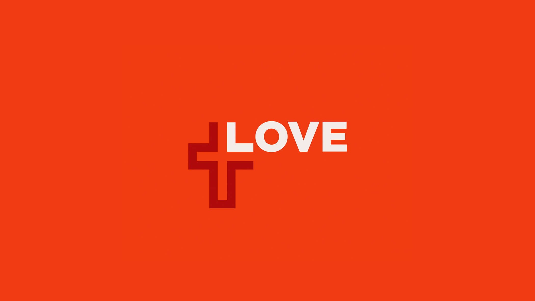
A mark by Allan Peters that in my opinion couldn’t be more perfect. Uniform line weight, and matching type weight, work together to demonstrate the power of simplicity.

Simple geometric shapes and a high contrast palette, work together to create a fresh and memorable mark by Jay Fletcher.

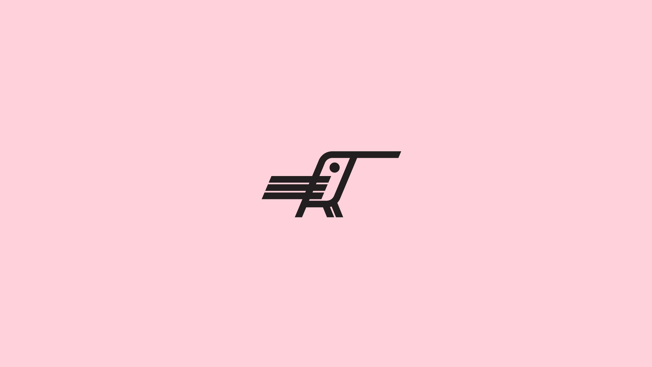
Simplicity abounds in this hummingbird mark by Blake Suarez. Thick lines and high contrast color, create a simple, strong mark.

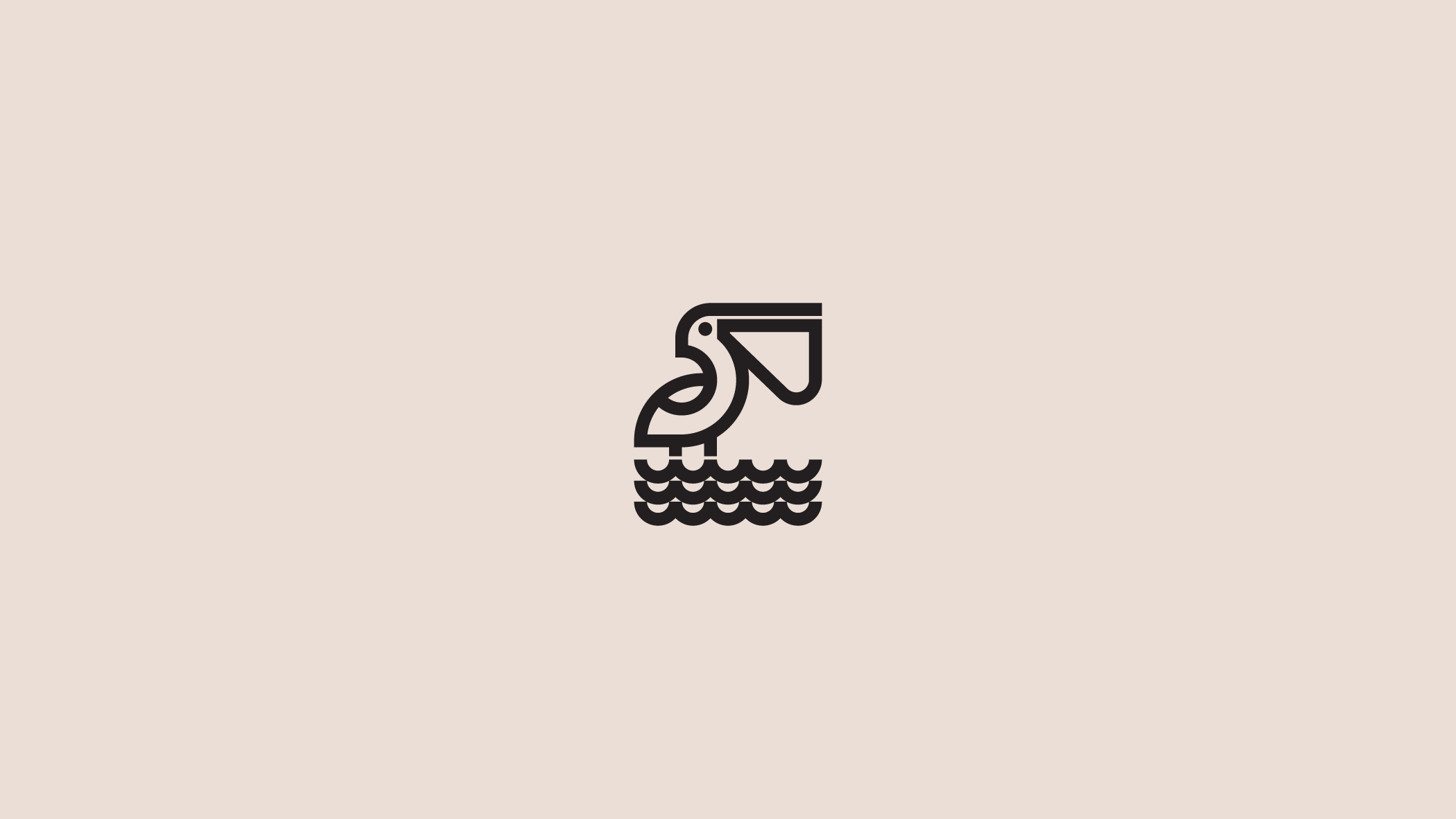
Blake Suarez employs thick lines and geometric shapes for ultra-simplicity in this mark for Pelican Oyster Co.

Considered Reduction

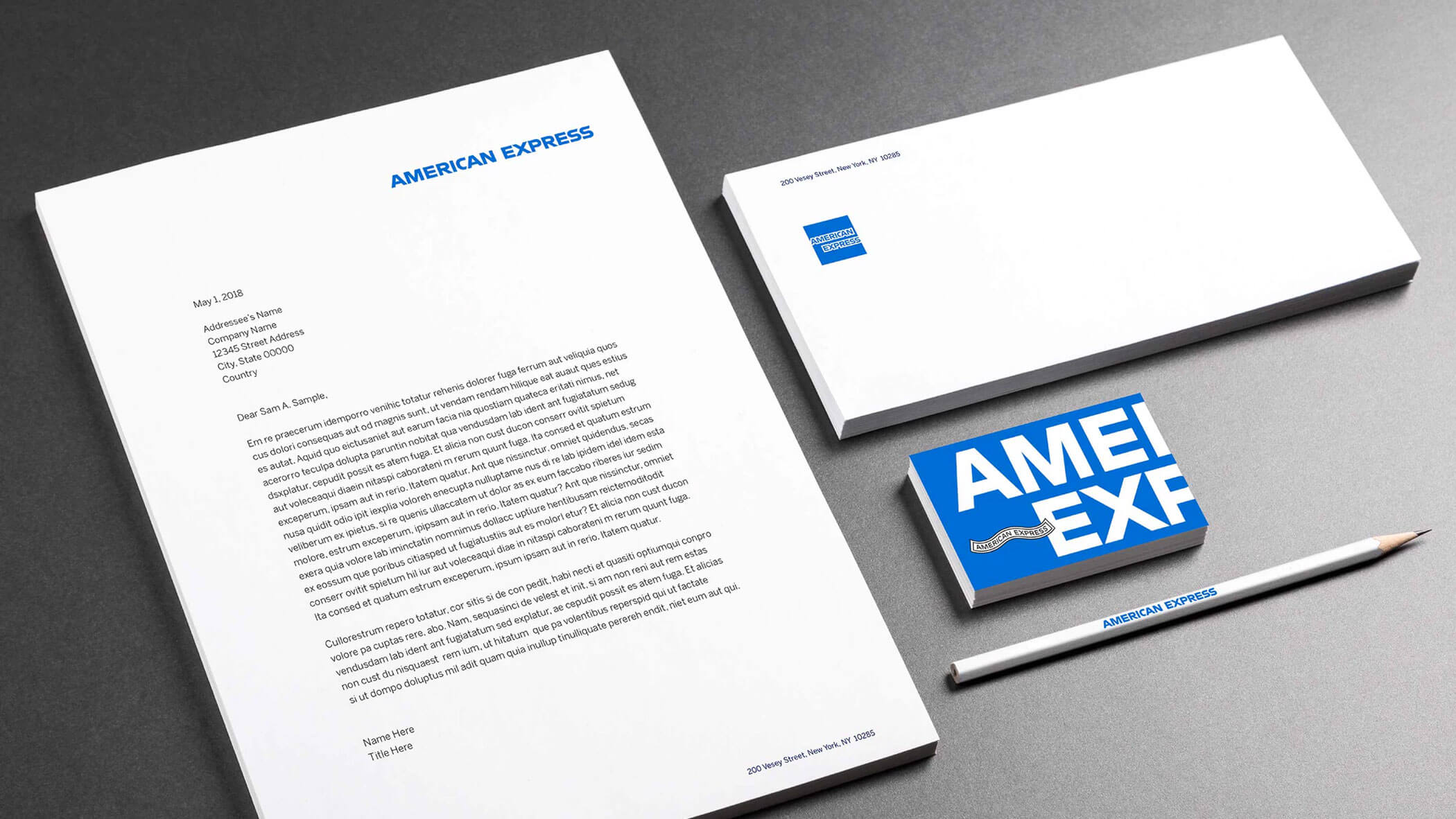
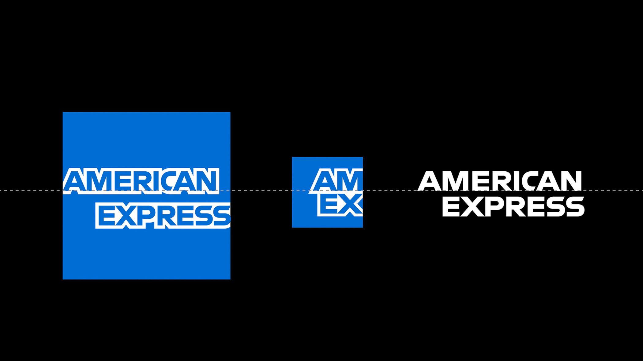
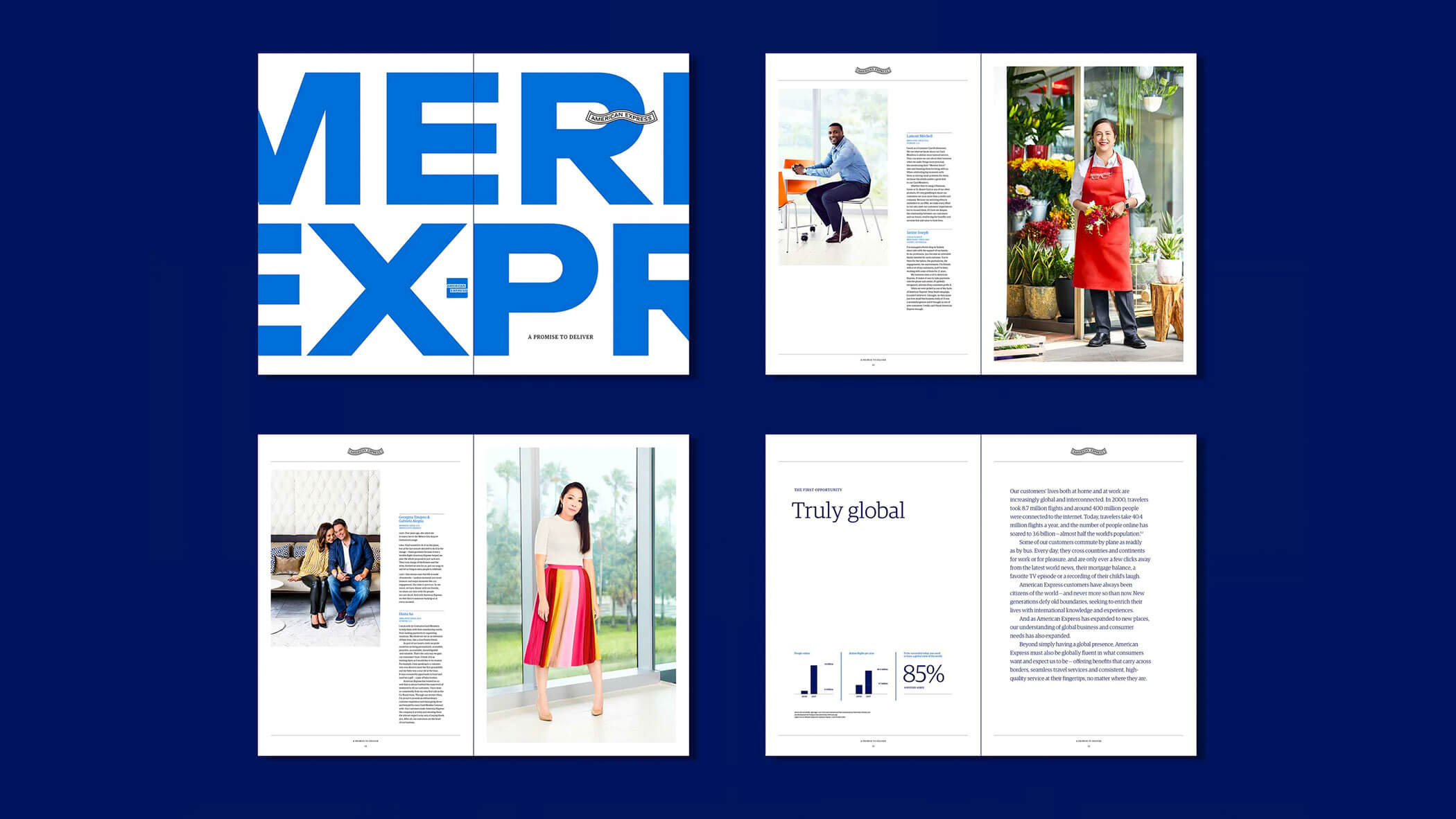
Pentagram, the world’s largest independently-owned design studio, is no stranger to complex design challenges. The solutions they create are carefully crafted and seemingly simple. The power of simplicity is evident in their approach to evolving global brands that carry with them tremendous equity. They are masters of evolving, culling, and refining brands to work seamlessly in the digital age.

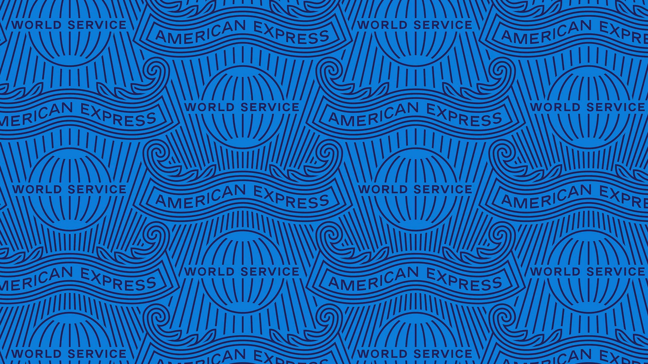
In this example their strategy employs the evolution of an iconic mark, paired with the development of a modern design language. The essence of the brand remains, but it’s been pared down its simplest form. Only what’s necessary remains.

Images by Pentagram

Want Better, Not More

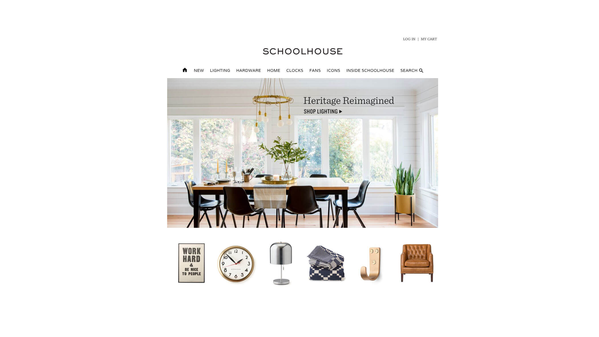
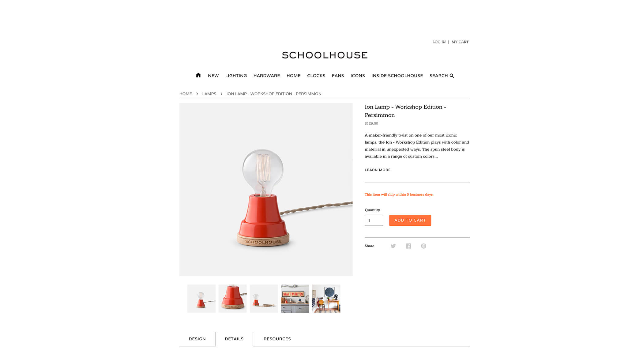
At the very top of the simple lifestyle inspiration list for me is retail brand Schoolhouse. A community of crafters, creators & collectors dedicated to the preservation of American manufacturing. Their ethos rings so true to me and is reflected in everything they do. Want better, not more. Their innate affection for pieces with a past and the belief that something worth owning now is worth owning forever resonates strongly. Their less-is-more approach to the products they offer and the way they stand out in a cluttered and visually chaotic world is impressive.

The choice to design simply, thoughtfully, and elegantly is evidenced in their approach to product styling and photography. The simple clean layouts and typographic treatments used in both print and online communications truly create a memorable experience. An ever-present focus on quality, and mixing of eras and styles, encourages people to collect what they love and embrace individuality. Simplicity to me, is buying a thing once, and loving it forever. A brand ethos that many, who feel counter to our disposable culture, are aligning to.

Images by Schoolhouse

Simplicity is the keynote of all true elegance.

Coco Chanel

All You Need is Less

While the pursuit of simplicity in design is worthwhile, it’s rarely accomplished quickly or easily. Achieving it requires time, and more complex thinking. In an effort to be mindful of simplicity in my own work, I find aligning to a few key questions throughout the design process helps to keep things on track.

I’m constantly asking:

  • Is there a better way to convey the meaning or purpose of this communication?
  • Is each element absolutely necessary?
  • If I show this to my 11 year old will he get it? (Immediately?)
  • Am I open to alternate approaches, or am I “wedded” to this one idea?

Simplicity in design works. By removing excess, we enable clarity, and create instant recognition. Think Apple or Nike, it’s no accident that some of the most powerful companies in the world are represented by the simplest and most memorable marks.

Whether it’s a printed communication, logo, or website, the pursuit of simplicity can yield countless benefits. For your next design project, try making simplicity your choice. Keep these questions handy, or develop a list of your own. They’ll keep you accountable to your goal, and likely produce more crafted and considered work.